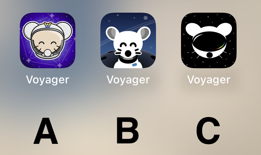
B!
Voyager
The official lemmy community for Voyager, an open source, mobile-first client for lemmy.
Rules
- Be nice.
- lemmy.world instance policy
Sponsor development! 👇
💙
B
I don't like any of them. That said, I voted for C. It's kinda plain, but that's what I like about it. The other ones are too messy.
B.
B
B
B
All are very good, but B takes the cake for me personally.
Voted C. It's by far the most robust option. It looks stylish, professional, and could easily accommodate a flat, 1-color design.
B my lord
Definitely B
B
B 100% !!! It's so cute
It’s really cool to have such talent in this community to go along with such an amazing app. The 3 finalists are really good. I don’t usually use dark icons but I love C so much. I hope to see variations of it as the app grows. Congratulations to all who made it to the top 3! That in itself is an accomplishment. I can’t wait to see the results of the final! This community is awesome!
B. A is also good. Don't like C at all.
C mouse with A background please
C
C looks like Daft Punk mouse
C
B Please! Looks so very clean.
C
Quick comparison on Android (custom launcher): https://i.ibb.co/XVnM2NL/comp.png
A looks like something an elementary school aged kid would have on their iPad for help learning to add.
B's got my vote.
A and B has too many details for an app icon that isn’t for a game.
🅱️
B gang
I like B the best.
C
B with the helmet of A (minus the “V”)
Really like A! Good job to all participants though!
B
Definitely B
i vote for B cuz i think it's the cutest 🐭
I prefer what we already have but if we have to change then go with A


