
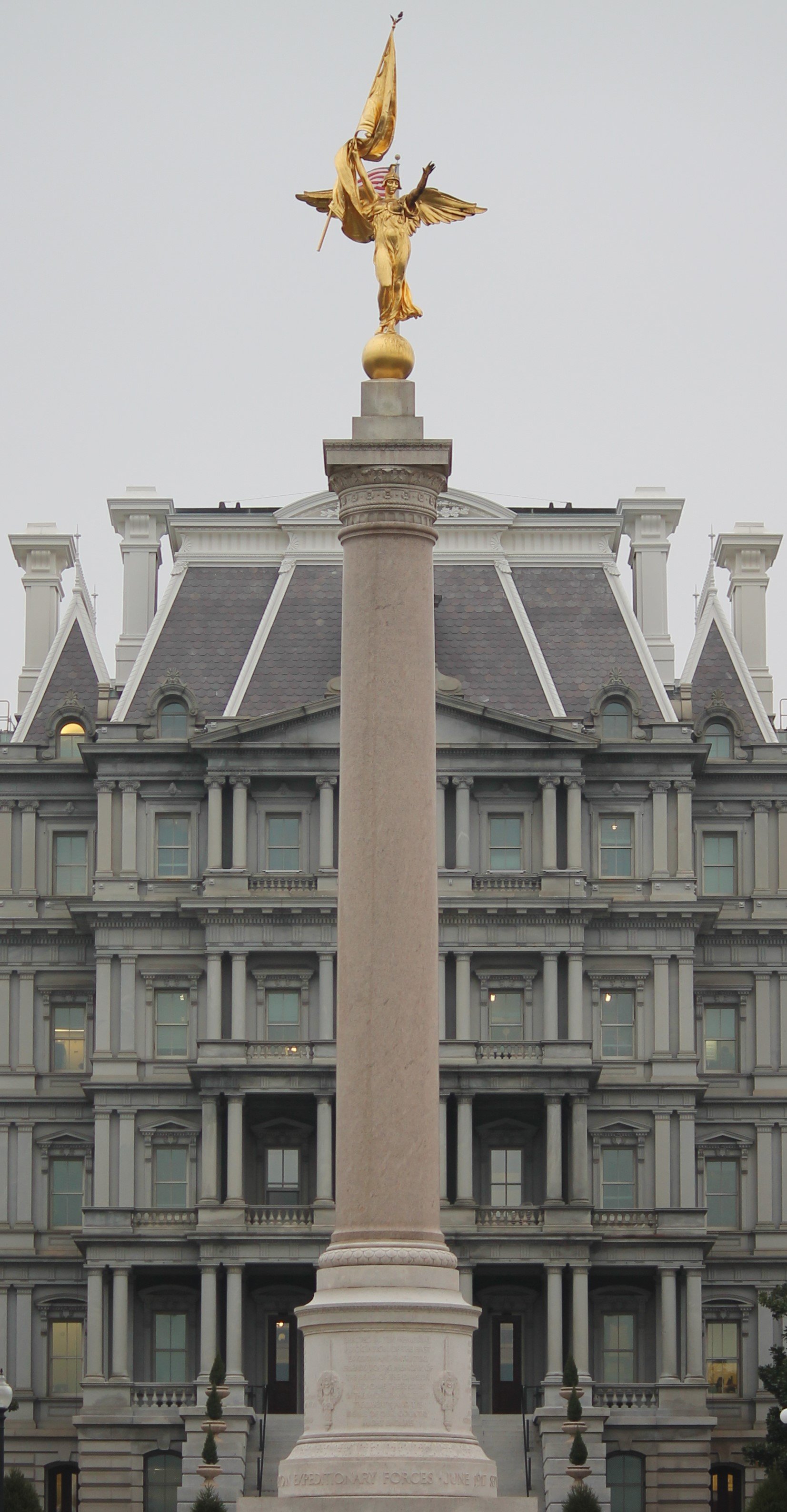
I hope I don't offend with the slight asymmetry
Canon Rebel T3 | F4.0 | 1/100s | ISO 200 | 55mm
Rules:
1.. Please mark original photos with [OC] in the title if you're the photographer
2..Pictures containing a politician from any country or planet are prohibited, this is a community voted on rule.
3.. Image must be a photograph, no AI or digital art.
4.. No NSFW/Cosplay/Spam/Trolling images.
5.. Be civil. No racism or bigotry.
Photo of the Week Rule(s):
1.. On Fridays, the most upvoted original, marked [OC], photo posted between Friday and Thursday will be the next week's banner and featured photo.
2.. The weekly photos will be saved for an end of the year run off.
Instance-wide rules always apply. https://mastodon.world/about
I hope I don't offend with the slight asymmetry
Canon Rebel T3 | F4.0 | 1/100s | ISO 200 | 55mm
It’s sooooo close, but that tiny bit of asymmetry just throws it off, especially given the title.
Can I suggest reducing the depth of field effect by blurring the background building just enough to make the asymmetry less obvious? The overall effect might be less striking but other than reshooting the pic I can’t think of another fix.
Thanks for the suggestion! This approach might come in handy in the future to fix other "flat" pics. Never thought of this before.
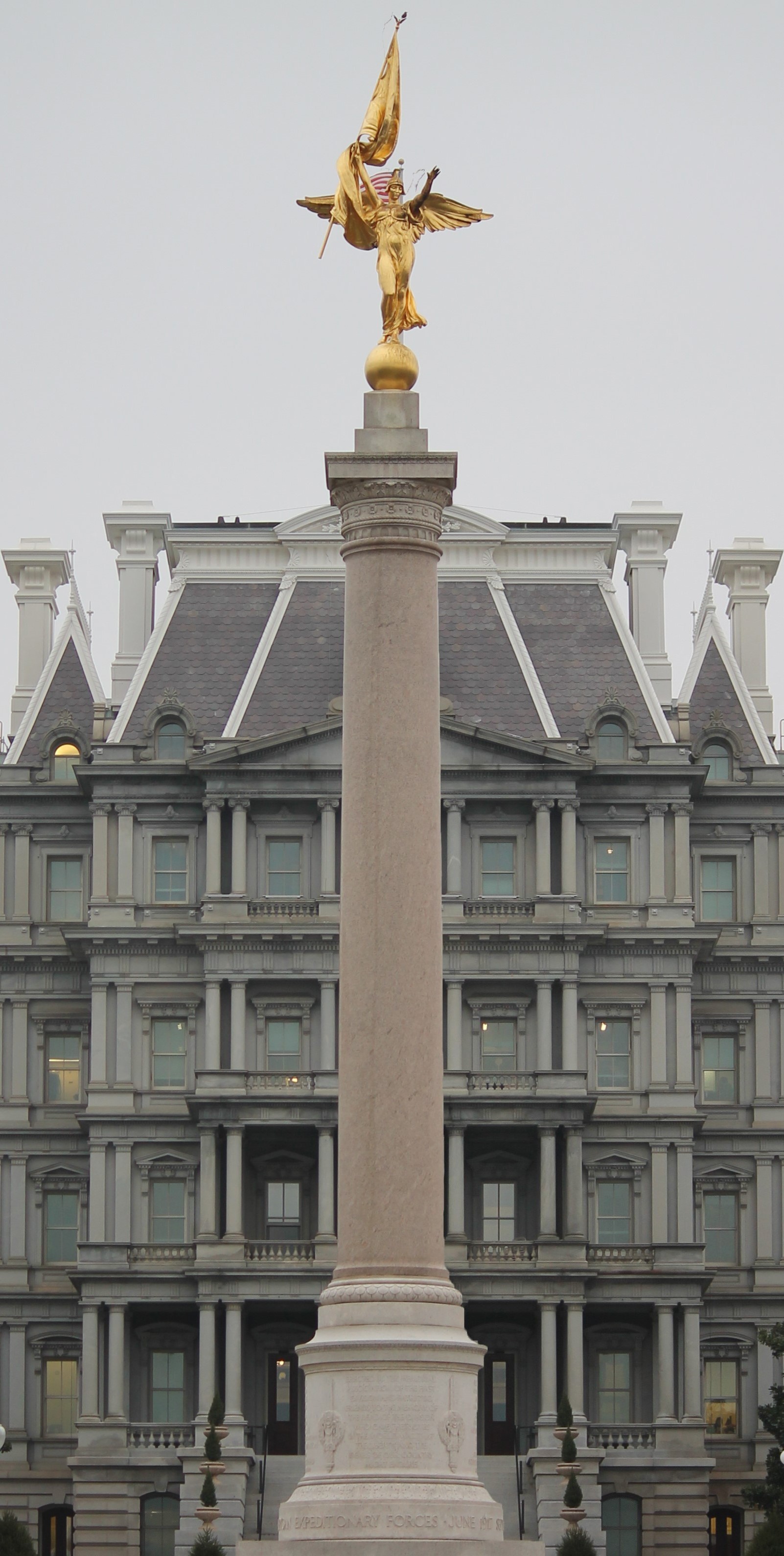
Here's the result:

It definitely helps to hide the assymetry a little and also makes the statue pop out more. It's a little less.... homogeneous(?) than it was before, but I think it's an improvement.
I'm Curious. it looks very very symmetrical. What asymmetrical part are you talking about? The lights in the windows?
Here it is photoshopped with the columns of all the windows having the same spacing towards the image's center. Simply moved the right part a little to the left behind the main column until it seemed symmetrical.
In the original, the right part of the house, as seen by all those little columns, was a little more visible than the left.