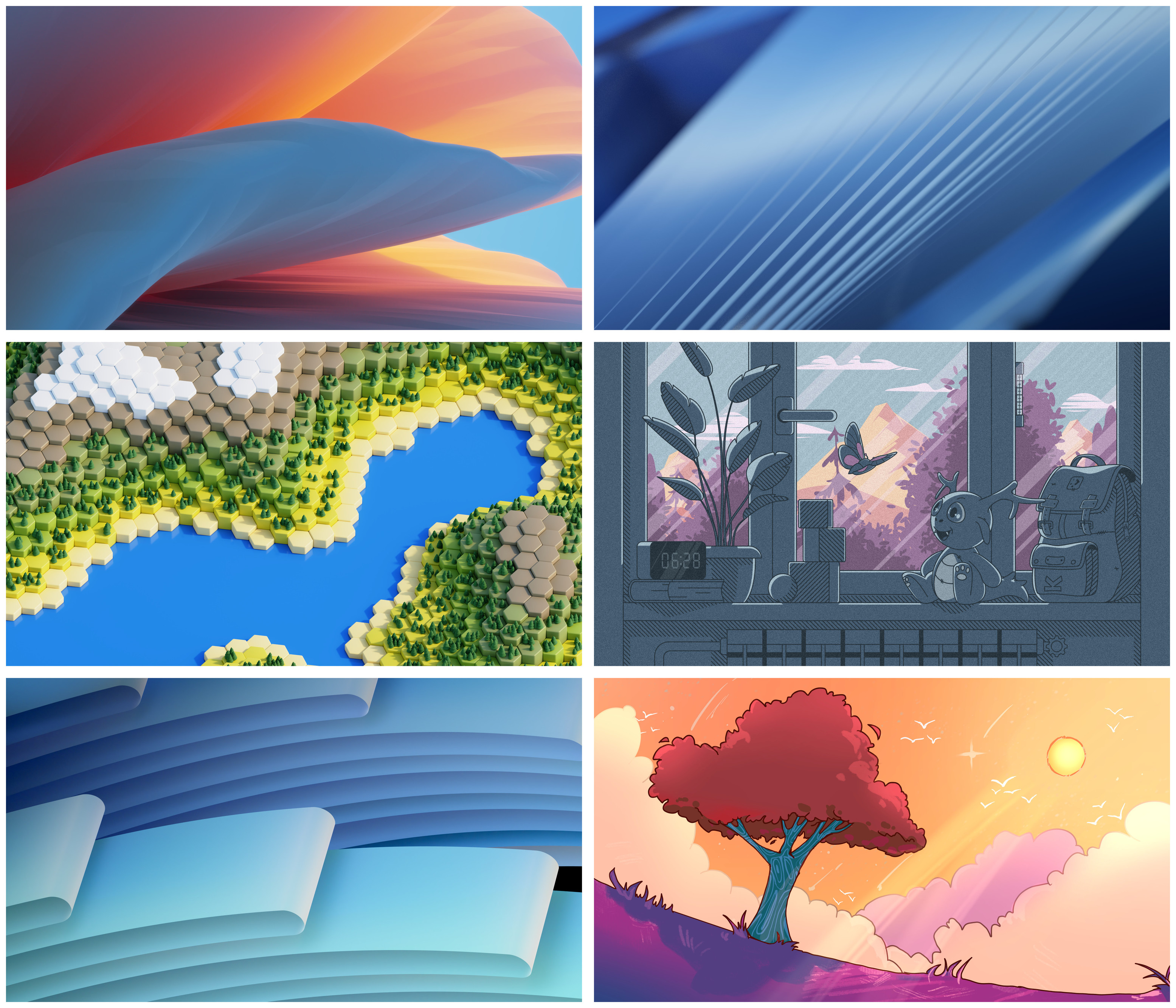
All of them are beautiful, but I like the middle-left one the most
KDE
KDE is an international technology team creating user-friendly free and open source software for desktop and portable computing. KDE’s software runs on GNU/Linux, BSD and other operating systems, including Windows.
Plasma 6 Bugs
If you encounter a bug, proceed to https://bugs.kde.org, check whether it has been reported.
If it hasn't, report it yourself.
PLEASE THINK CAREFULLY BEFORE POSTING HERE.
Developers do not look for reports on social media, so they will not see it and all it does is clutter up the feed.
@[email protected] @[email protected] tf you mean I have to choose 😭
@ioletsgo @[email protected] @[email protected] only you can choose the plasma 6 wallpaper. you MUST choose an image!!!
@thememesniper @[email protected] @[email protected] I can only really choose which one I feel works the worst as a wallpaper (They actually took notes that it might be hard to see icons with number 3)
Bottom right though center left is off doing its own thing which I can respect
@[email protected] @[email protected] I would say top right (more formal) or bottom right (friendlier)
@[email protected] @[email protected] why not include them all as an option? They're all beautiful and worthy of KDE!
Honestly? Bring em all
6
@[email protected] @[email protected] Bottom right corner or the one above (with a lovely tiny creature 😄)
Middle left, middle right, or bottom right
Top left
Top Right and Bottom Left.
This is hard, so many are great!
All of these are pretty good
1,2,3,5
Didnt see those yet! Awesome work!
In the Forum thread there are way more that are just as awesome
https://discuss.kde.org/c/community/wallpaper-competition/26
None, they are all too bright!
Top right. Would be better if black and silver.
@[email protected] @[email protected] Sun/comet, my favourite! Congrats anyway to all the finalists! 👏👏
Bottom left and top right are really good
@[email protected] @[email protected] I think the hexworld one is my favorite. The middle-left one in this collage.
I prefer black backgrounds in general. Do these have counterparts for dark theming?
The only wallpaper I really liked after all these years is Haenau. Is it going to be dropped in 6? I really like simply themes, but the subtle constant change is a nice to have. It works with light AND dark themes.
Middle left!
@[email protected] @[email protected] The new wallpapers are very nice, I can't wait to see them in Plasma 6.0. As I understand this is not the final version, should we expect more improvements?
I love the top left flying pillow wallpaper. 😜
I like the bottom left cause it's more in line with the style KDE normally selects.
Feeling middle left. Bottom right is a very close second.
The top two and bottom left are too generic for my tastes.
Number 6 is great. But make sure you pay the royalties to Emily Gwen for using her pride flag as inspiration.
OOoh I love the bottom left and middle right
Hexagon terrain is the best and super neat
@[email protected] @[email protected] how could you possibly ask me to pick between these 😭 all of them of course!
@[email protected] @[email protected] I love all of these great artworks! 🥰 But the last one with the tree transports so much of detail and expression KDE stands for in such a lovely way which would make me choose this one! 😊✨
