this post was submitted on 19 Oct 2023
548 points (100.0% liked)
196
16430 readers
2272 users here now
Be sure to follow the rule before you head out.
Rule: You must post before you leave.
founded 1 year ago
MODERATORS
you are viewing a single comment's thread
view the rest of the comments
view the rest of the comments

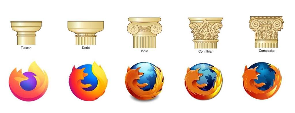
^^ imo the logos under the "Doric" and "Tuscan" pillars are my two favorites. I like the slightly more detailed one better than the flat logo, but I completely understand why they changed it and there are some way worse examples of logos getting butchered by becoming too simple.