this post was submitted on 06 Sep 2023
30 points (100.0% liked)
Rust
6800 readers
8 users here now
Welcome to the Rust community! This is a place to discuss about the Rust programming language.
Wormhole
Credits
- The icon is a modified version of the official rust logo (changing the colors to a gradient and black background)
founded 2 years ago
MODERATORS
you are viewing a single comment's thread
view the rest of the comments
view the rest of the comments

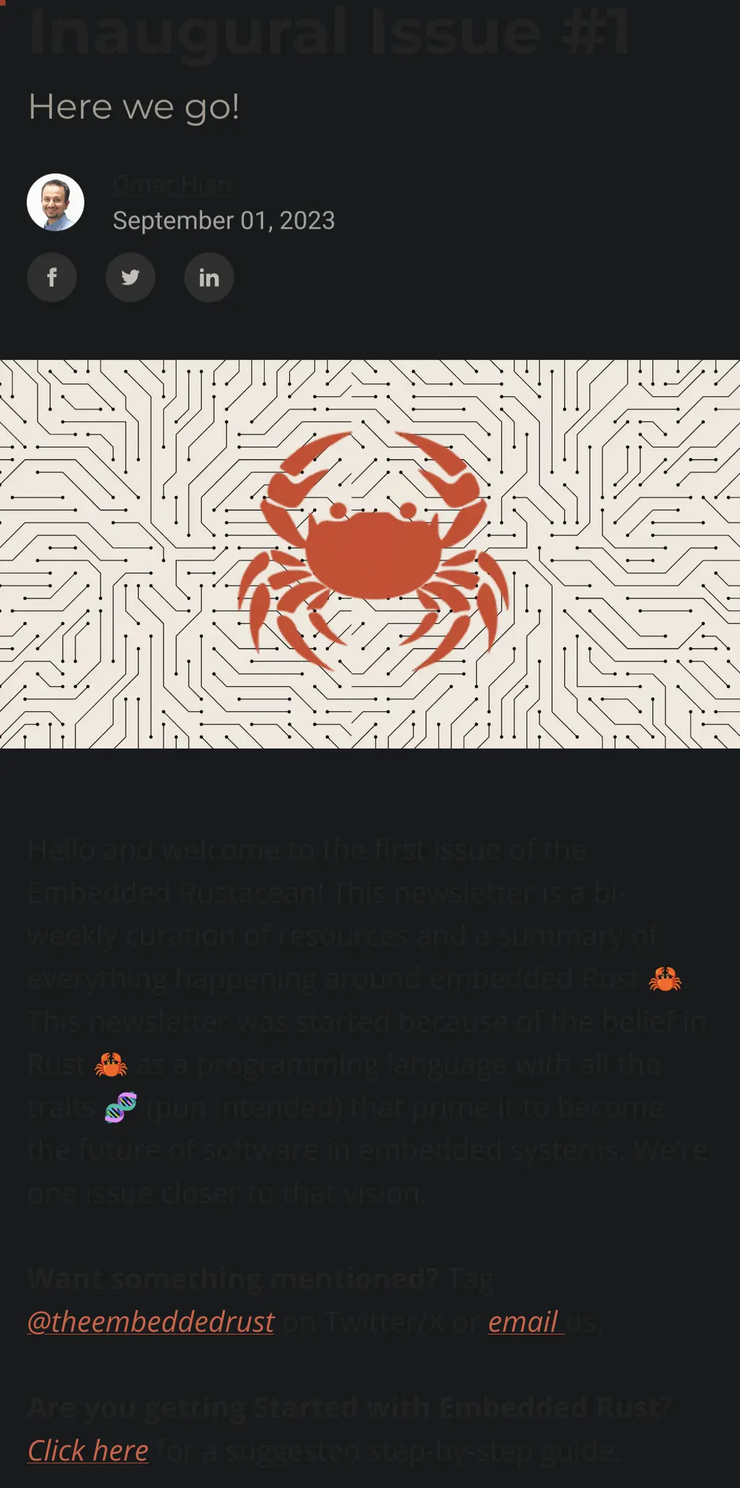
Idk if it's mobile or dark mode, but the page is totally unreadable
I tried switching to light mode and it was still completely unreadable. Grey text on a darker grey background is a very poor choice
I went back and checked, it's black text on a white background. Could you probably provide more insight where/how you are seeing this effect so that I can try to address this?
Sure. I'm using Firefox on Android. I'm not sure if I'm uploading images correctly or not but I'm trying to attach a screenshot of what it looks like for me
I looked at the other comment, it was the Firefox addon dark reader. Turning that off solved my problem in stock Firefox dark and light modes
Awesome! I'm glad its resolved. I'll see if darkreader can be accommodated in the future as well to reduce the hassle. I hope you enjoy the newsletter!