this post was submitted on 27 Aug 2023
342 points (98.0% liked)
Data Is Beautiful
7228 readers
13 users here now
A place to share and discuss data visualizations. #dataviz
founded 4 years ago
MODERATORS
you are viewing a single comment's thread
view the rest of the comments
view the rest of the comments
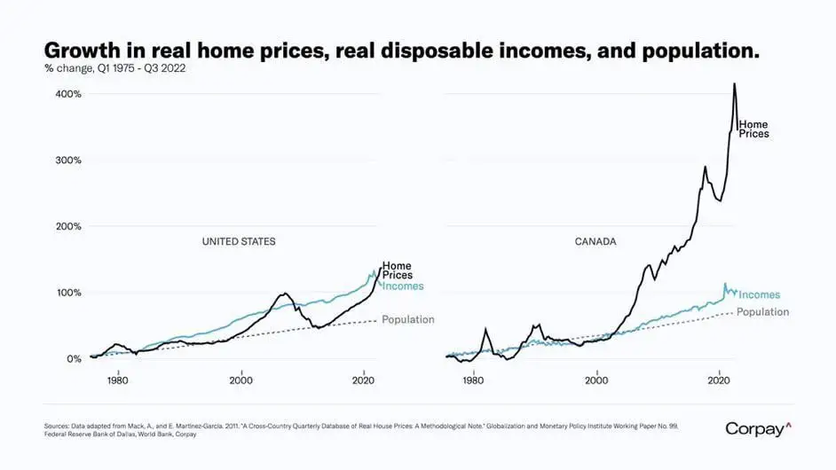
I hate it when the chart doesn't say what it depicts. I assume those are averages, not median. The average hides that fact that most people's real income has barely grown in 20 years. All the income growth comes from the top 20% or so, you don't see that in the average.