this post was submitted on 15 Dec 2024
810 points (98.6% liked)
United States | News & Politics
7307 readers
269 users here now
founded 4 years ago
MODERATORS
you are viewing a single comment's thread
view the rest of the comments
view the rest of the comments

The reason there isn't a revolution in the USA is mostly down to atomization. Suburban growth directly leads to insular communities with no sense of responsibility to the rest of their brothers and sisters. Working class families in the burbs have functionally 0 ability to organize.
To add that on, I like to underscore the gravity of the situation here with details:
The interest on his earnings alone is equivalent to 130,000 workers at the start of the top 10%. That's the entire workforce of American Airlines for comparison.
If the average person was paid like the 0.1% for 1 year they could retire and live off 65k/yr forever.
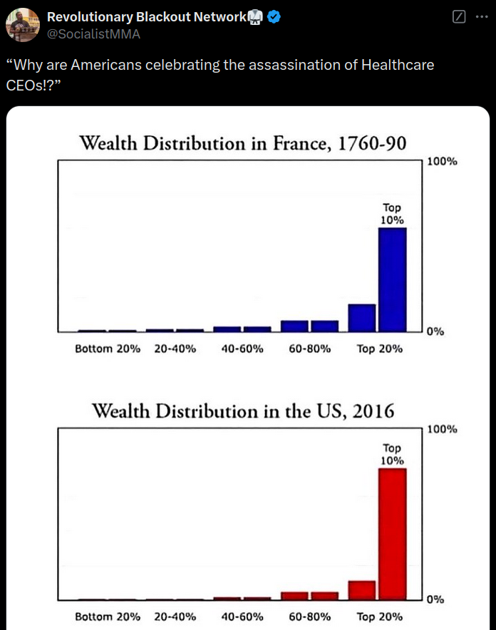
This chart is broken down by quintiles but it illustrates the disparity well imo.
Half of the wealth of the top 20% here (excluding top 1%) is in businesses or real estate they own. Most of that will be their own house and a small business, though ~~leeches~~ "landlords" mostly fall in this category too.
For the top 1% that's more like 20% of their net worth.
Not sure where you're getting your income percentiles from.
This site shows that 90th percentile (top 10%) household starts at $230k and 99th percentile (top 1%) starts at $631k.
For individuals the same site shows that the 10% starts at $150k and the 1% starts at $430k.
https://www.investopedia.com/personal-finance/how-much-income-puts-you-top-1-5-10/
Because holy shit does "dqydj.com" look sketchy as fuck. The fact you clicked on a URL called that has me worried for your safety.
Like skipping through a minefield
Ok, I see where your source went wrong. Par for the course for Investopedia, which tends to get a lot of little details wrong (and sometimes misses the mark on the applicable scope of data that someone else has reported). But they've cited the Economic Policy Institute study of 2021 incomes, which looks at the average (mean) earnings within that group, rather than the actual amount that represents the boundary of that group. So it's not that it takes $3.1 million to be in the top 0.1%, it's that all the people of the top 1% average out to $3.1 million per year. Which, for the type of power distribution for household or individual incomes, is skewed heavily by the people who have the highest amounts.
And looking at the mean within that group can be fine, for certain purposes, but they've gone with the incorrect headline of saying "how much income puts you in the top 10%, 5%, 1%, 0.1%?" So it's a headline that is wrong, that reports on a different number within the data.
And your own comment, saying that reaching each percentile "starts at" the reported number, is also wrong.
It just stands for "don't quit your day job" and I've found that it's a reliable resource for statistical data that's widely available (like the ASEC numbers published by the Census Bureau and left to other people to actual turn into data visualization). It's up to date, and the data matches the summary report on the Census website, so what's the problem? The summary only reports the 90th and 95th percentiles, though, so I needed to find someone who actually reported on the thresholds for 99 (and not the averages within the top 1%).
TIL - Thanks for the context on dqydj.com
Cause that would've been a straight "report spam" if I got an email from them.