this post was submitted on 20 Nov 2024
183 points (98.4% liked)
Map Enthusiasts
3616 readers
296 users here now
For the map enthused!
Rules:
-
post relevant content: interesting, informative, and/or pretty maps
-
be nice
founded 2 years ago
MODERATORS
you are viewing a single comment's thread
view the rest of the comments
view the rest of the comments

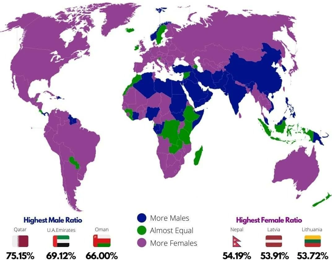
I'm guessing the pink ones are the countries that are the most at war with other countries.
Or the blue ones are the ones that recently got out of war and are experiencing the Returning Soldier Effect
Life expectancy is longer for women, so I think it's just countries with nothing weird going on, but they'll still have significantly more older women than older men.