this post was submitted on 01 Nov 2024
517 points (97.4% liked)
Data is Beautiful
5142 readers
3 users here now
A place to share and discuss visual representations of data: Graphs, charts, maps, etc.
DataIsBeautiful is for visualizations that effectively convey information. Aesthetics are an important part of information visualization, but pretty pictures are not the sole aim of this subreddit.
A place to share and discuss visual representations of data: Graphs, charts, maps, etc.
  A post must be (or contain) a qualifying data visualization.

  Directly link to the original source article of the visualization
    Original source article doesn't mean the original source image. Link to the full page of the source article as a link-type submission.
    If you made the visualization yourself, tag it as [OC]

  [OC] posts must state the data source(s) and tool(s) used in the first top-level comment on their submission.

  DO NOT claim "[OC]" for diagrams that are not yours.

  All diagrams must have at least one computer generated element.

  No reposts of popular posts within 1 month.

  Post titles must describe the data plainly without using sensationalized headlines. Clickbait posts will be removed.

  Posts involving American Politics, or contentious topics in American media, are permissible only on Thursdays (ET).

  Posts involving Personal Data are permissible only on Mondays (ET).
Please read through our FAQ if you are new to posting on DataIsBeautiful. Commenting Rules
Don't be intentionally rude, ever.

Comments should be constructive and related to the visual presented. Special attention is given to root-level comments.

Short comments and low effort replies are automatically removed.

Hate Speech and dogwhistling are not tolerated and will result in an immediate ban.

Personal attacks and rabble-rousing will be removed.

Moderators reserve discretion when issuing bans for inappropriate comments. Bans are also subject to you forfeiting all of your comments in this community.
Originally r/DataisBeautiful
founded 2 years ago
MODERATORS
you are viewing a single comment's thread
view the rest of the comments
view the rest of the comments

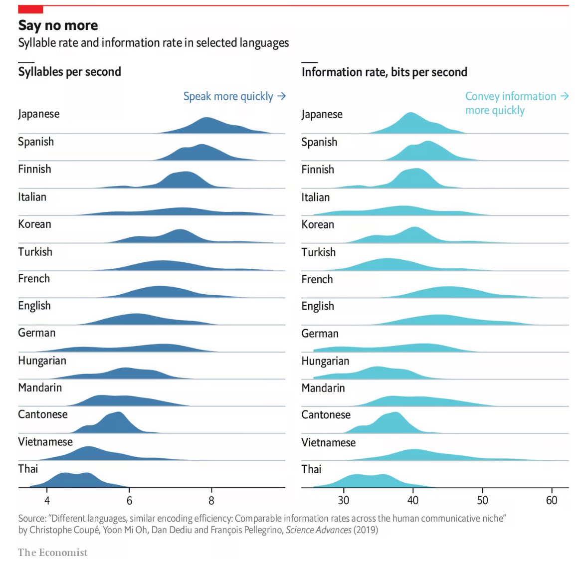
What produces the stretched graphs like Italian and German? What do these humps mean?
Variability in the length of words, loads of very short and very long words? Just a guess
That is likely part of it and also explains why languages like Japanese are more tightly grouped, as there is less spread in word length for Japanese versus English or Italian.
Both of those languages LOVE to compound their nouns - smashing smaller words into massive ones. Like the simple "pasta + asciutta = pastasciutta = dried pasta" or not simple "Donaudampfschifffahrtsgesellschaftskapitän = Danube steamship transport company captain". All languages do it, but these do it with gusto.
Maybe they didn't account for various factors like age or mood.
Moreover, Munic has 130 words per minute and dortmund has 180 words. There's a ddifference in the dialect
I would guess, if it's solid empirical work behind this, that there's just greater differences internally between German and Italian speakers than for many other languages. Having lived in both Germany and Italy, I do not struggle to believe this is the case.