this post was submitted on 20 Sep 2024
776 points (98.7% liked)
Memes
47000 readers
800 users here now
Rules:
- Be civil and nice.
- Try not to excessively repost, as a rule of thumb, wait at least 2 months to do it if you have to.
founded 5 years ago
MODERATORS
you are viewing a single comment's thread
view the rest of the comments
view the rest of the comments

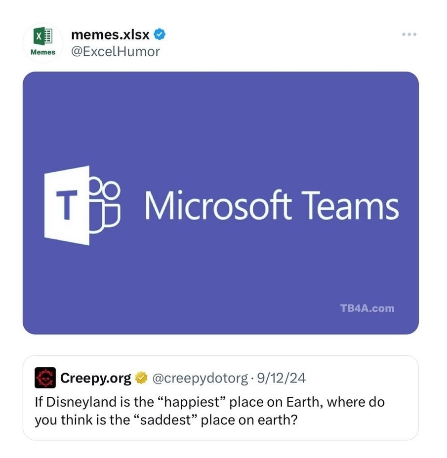
Teams is such a confusing app. To start off, what is it meant to be? A frontend for onedrive? A chat app? A videocall app? It's like microsoft's attemp to make their own everything app. What was wrong with Skype? Actually, Teams shows up as "skypeforlinux" (complete with a Skype icon) in Pavucontrol, so is the videocalling part of teams just a re-packaged skype? Why does the web version of teams have its own integrated Excel which is slightly different from standard web excel? It feels like the UI was specifically designed to mislead. There is a list of icons on the left that allow you to switch between different contexts in the app. The visual design makes it look like a set of radiobuttons, except clicking on some of them twice does a different action... There is a home screen, and then also a second SUPER HOME screen!? I can't even get angry it at for being a slow bloated jumble of spyware like the rest of microsoft's garbage (which it is), I just feel a sense of morbid fascination every time I'm forced to use it. It feels like an AI-generated app from a future where AI is much more capable but still utterly fails at understanding humans. It's the uncanny valley of user experience.
One thing I miss about Lync (maybe the only thing lol) was that each chat was a separate window. ...you couldn't combine them unfortunately but I often find myself wishing I could pop a chat out of Slack, Discord, etc.
Yeah discord let's you too! On the actual desktop app, at least, unsure about discord web... I believe I used teams' pop out in browser feature once, though!