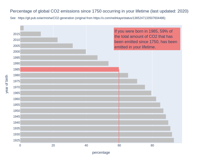
For some years now, I have seen this graph go around on social media. I think it's a powerful image, because it shows us so clearly that it is happening in our lifetime and under our watch.
But when I use it in my work, I always add the disclaimer the the graph does not show when it was made.
Because that is a problem: the graph might show us that if you are currently 30 years old, 50% of all the CO2 that has been emitted since 1751 has been emitted in your lifetime. But that percentage changes over time.
By now, for people who are currently 30, the percentage will be higher, simply because the annual emissions have gone up since the graph was made.
So I made a new version of the graph, the interactive version of which you can find here: http://mishathings.org:8050/
I wrote a post about this: https://mishathings.org/2024-08-12-how-much-co2-has-been-emitted-in-my-lifetime.html

Time doesn't always go on the x-axis, but it is expected that the "independent" variable goes there, which is time in this case. This orientation does make it a lot more readable on mobile though in portrait mode, but the slider is unreadable in the mode. Which means it should probably assume landscape mode anyways, in which case x=year would be better. Given the "x-axis" is at the top on the original, I think you are intended to look at it sideways (like a full page landscape graph in print form), such the the left side is the x-axis? But the %s being at the bottom of the new one make it harder to see that label (on mobile at least) and changes what is the implied x and y axis.
But if the independent variable was "words in a book" and you were using that to predict time needed to complete the book, time should be on the y-axis.