3DPrinting
3DPrinting is a place where makers of all skill levels and walks of life can learn about and discuss 3D printing and development of 3D printed parts and devices.
The r/functionalprint community is now located at: [email protected] or [email protected]
There are CAD communities available at: [email protected] or [email protected]
Rules
-
No bigotry - including racism, sexism, ableism, homophobia, transphobia, or xenophobia. Code of Conduct.
-
Be respectful, especially when disagreeing. Everyone should feel welcome here.
-
No porn (NSFW prints are acceptable but must be marked NSFW)
-
No Ads / Spamming / Guerrilla Marketing
-
Do not create links to reddit
-
If you see an issue please flag it
-
No guns
-
No injury gore posts
If you need an easy way to host pictures, https://catbox.moe may be an option. Be ethical about what you post and donate if you are able or use this a lot. It is just an individual hosting content, not a company. The image embedding syntax for Lemmy is 
Moderation policy: Light, mostly invisible
view the rest of the comments

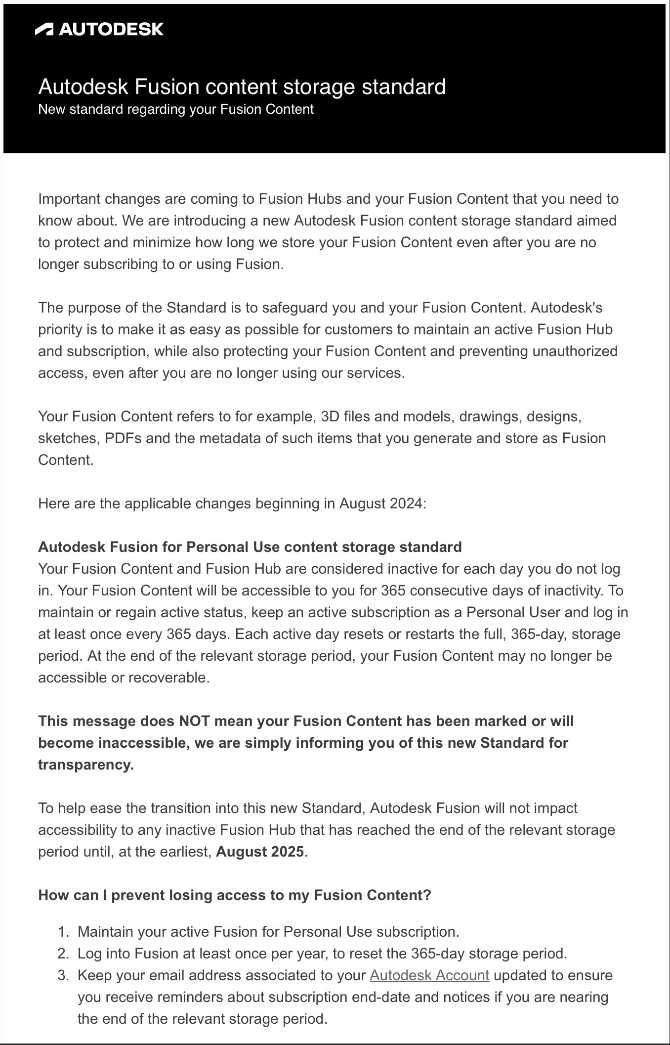
If you're a beginner: get used to a different software, because Autodesk is the king of enshittification. Your files will be hostage and then you're going to pay the subscription to keep them alive. Don't waste your precious time in mastering Autodesk applications, the more you wait the harder is the switch
It's just so rough to switch away from the one major CAD suite that doesn't tar and feather UX devs on sight. Seriously, I like solidworks and solidedge and etc etc, but holy cow those interfaces are just unpleasant to use if you haven't been steeped in them for the last 30 years. Even Rhino is more intuitive.
Having tried Fusion 360... It's interface and design paradigm is utter trash. NX, Creo, and Solidworks are all far ahead. Can't speak for catia, I've never used it but the versions I saw looked worse than Fusion
We all have our preferences, although some people's are clearly more insightful than others...
UX isn't universal. What intuitively clicks for one person might be unusable for someone else. Good UX is adequate for as many people as possible, but it can't be perfect for everyone at once when some people work best with large labelled buttons with big, clear icons that have to go into submenus to fit on the screen, and other people prefer lots of small buttons whose purpose and location they've memorised which all fit on screen at once to save them needing to click into submenus.