this post was submitted on 27 May 2024
694 points (97.5% liked)
memes
11893 readers
2668 users here now
Community rules
1. Be civil
No trolling, bigotry or other insulting / annoying behaviour
2. No politics
This is non-politics community. For political memes please go to [email protected]
3. No recent reposts
Check for reposts when posting a meme, you can only repost after 1 month
4. No bots
No bots without the express approval of the mods or the admins
5. No Spam/Ads
No advertisements or spam. This is an instance rule and the only way to live.
A collection of some classic Lemmy memes for your enjoyment
Sister communities
- [email protected] : Star Trek memes, chat and shitposts
- [email protected] : Lemmy Shitposts, anything and everything goes.
- [email protected] : Linux themed memes
- [email protected] : for those who love comic stories.
founded 2 years ago
MODERATORS
you are viewing a single comment's thread
view the rest of the comments
view the rest of the comments
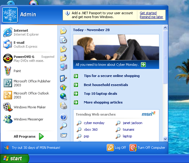
That's not nearly shitty enough. It's too useful. Look at all the options and other clickable things you got on the start menu, and it only took one click to open it.
That's not how this works anymore. If this were truly made today, it would be needlessly "streamlined", i.e. everything is hidden so as not to "clutter up" the UI with useful things, and make more room for...nothing. Just wasted space.
We hide everything behind multiple clicks now because the "average user" starts bleeding out their eyes if they're forced to see many things at once.
Also, icons. The icons in Windows XP are too recognizable. You need to minimalize them. In fact, minimalize it so hard that not one person could understand what the icon is even referring to.
Abstract art icons.
Folder: rectangle on its side. Start: triangle pointing up. Trash: rectangle standing up.
You could have shorted your comment. Now if you'll excuse me I have to deal with this eye bleed.