this post was submitted on 14 Jul 2023
11 points (100.0% liked)
Lemmy Apps
5513 readers
18 users here now
A home for discussion of Lemmy apps and tools for all platforms.
RULES:
- No spamming
- Be nice and have fun
- Follow the general lemmy.world rules
An extensive list of Lemmy apps is available here:
Visit our partner Communities!
Lemmy Plugins and Userscripts is a great place to enhance the Lemmy browsing experience. [email protected]
Lemmy Integrations is a community about all integrations with the lemmy API. Bots, Scripts, New Apps, etc. [email protected]
Lemmy Bots and Tools is a place to discuss and show off bots, tools, front ends, etc. you’re making that relate to lemmy. [email protected]
Lemmy App Development is a place for Lemmy builders to chat about building apps, clients, tools and bots for the Lemmy platform. [email protected]
founded 1 year ago
MODERATORS
you are viewing a single comment's thread
view the rest of the comments
view the rest of the comments

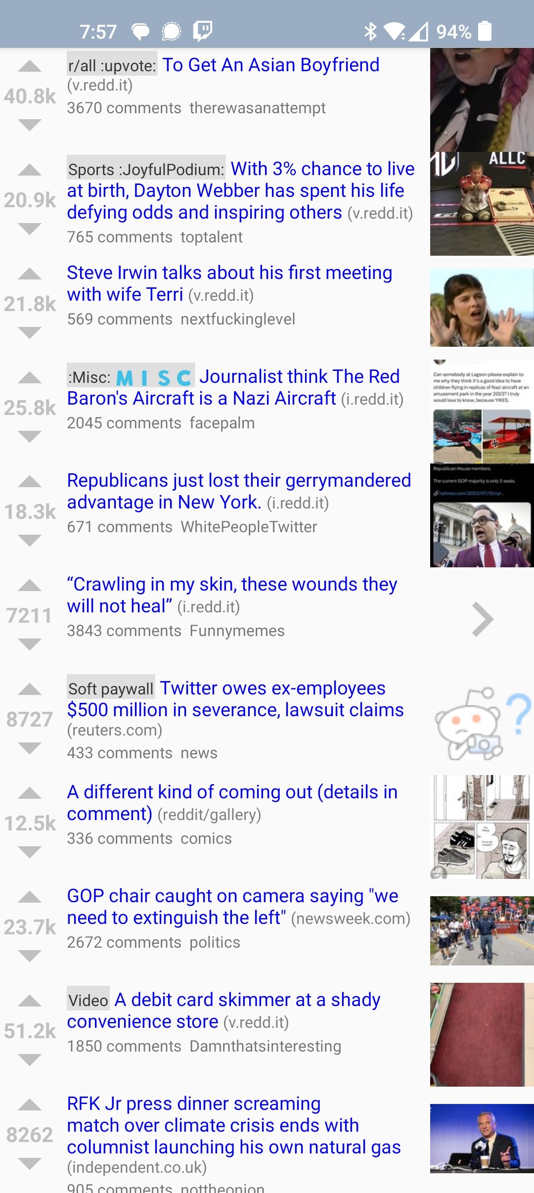
How did you got rid of the white bar separating post on connect?
its the Amoled theme I'm pretty sure
For me Amoled get black but keep the white bar :(
Weird. I was curious and double checked. It is indeed the stock amoled theme with the reverse card layout