this post was submitted on 03 Apr 2024
413 points (90.6% liked)
Programmer Humor
19463 readers
255 users here now
Welcome to Programmer Humor!
This is a place where you can post jokes, memes, humor, etc. related to programming!
For sharing awful code theres also Programming Horror.
Rules
- Keep content in english
- No advertisements
- Posts must be related to programming or programmer topics
founded 1 year ago
MODERATORS
you are viewing a single comment's thread
view the rest of the comments
view the rest of the comments

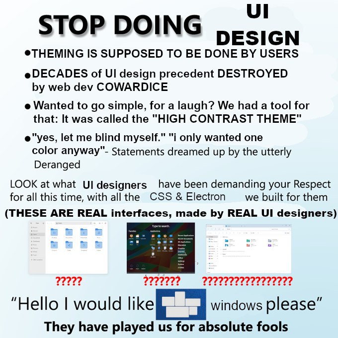
Look, if everyone just decided on a style and everyone went with it within a system I'd be okay with that. It's not great but at least it wouldn't be jarring.
But having to live by the whim of 50 different app designers is disgusting. I just want to have a good time, not learn 50 different interfaces.
Though my thoughts on it would also stifle new ideas. So that's bad.
It's like getting into a car you haven't driven before and you hit the wipers instead of the indicator ×1000. Or playing an FPS and E is now F, C is now Ctrl, X is Shift, and you tap+hold instead of tap. WHY?!?! You can remap, but suddenly there's conflicting keys for shit the tutorial hasn't even introduced to you yet, so you don't know what you can or can't get away with.
Some designer or dev has a personal opinion they think is better than everything else and now we all gotta live with it on the hopes that'll be the new standard. And there's so many of those arseholes and their DVORAK layouts and putting "Cancel" on the left and "Confirm" on the right of a dialogue popup. "I think it's better this way and the world will thank my big brain!"
YES I'm ranting, lol.
Wait confirm shouldn't be on the right? Like I am 99% sure most windows pop-up/modal Dialogs had ok on the left and cancel on the right but I am not entirely sure about Linux (also factorio has them left to right as in "go back and go forward" but I dunno if that is RTL dependent...)
No, no, they have to be on top of each other! Vertically aligned is the way of the future.
Try GNOME/GTK/adwaita apps. They are very consistent.
The GTK file chooser is probably the worst AND most inconsistent example of UX that I've ever seen
Contribute! Maybe you get a part of the 1 million Euro they got from the Sovereign Tech Fund.
Contribute with UX changes? To GNOME maintained software?
When it's an enhancement?
Enhancement? No, everything I have a problem with is explicitly intended behavior and GNOME devs are infamous for their everyone is stupid except me mentality
Edit, found a neat lil' example:
That's a dick way of saying fuck off but I mean they do provide a free service. If they have a vision and don't want to deal with random people whining about it that's their prerogative. Same as yours to find that utterly insufferable.
They do provide a free service (GTK's file chooser), one that I find horrible and inconsistent (as per the thread) and intentionally so (on issues tangential to example that I found, although the proposed configurable behavior would be nice) - so I won't even entertain the thought of trying and contributing to it, as it has been suggested.
I don't know what is insufferable about that, other than the initial criticism...
It's your prerogative to find them insufferable is what I meant to say. Your criticism and opinions are fair enough.
I've got to work on the fact that seeing the word "insufferable" on social media makes me instinctively get defensive ._.
Pretty sure that money is for the people employed by the GNOME Foundation, they don't just pay every contributor.
No, they don't, but you could get regular contributor…
They are indeed very similar.