Typography & fonts

17 readers
1 users here now

A community to discuss and share information about typography and fonts

Sibling community:

[email protected]

Rules of conduct:

The usual ones on Lemmy and Mastodon. In short: be kind or at least respectful, no offensive language, no harassment, no spam.

(Icon: detail from the title of Bringhurst's Elements of Typographic Style. Banner: details from pages 6 and 12, ibid.)

founded 1 year ago
MODERATORS
1


Pictures at the end.

This Release is from March 2023 but we're starting to see product on the shelf with the new look. I'm not a fan. The lettermark seems less distinctive to me. Too thick. What do you all think?

2


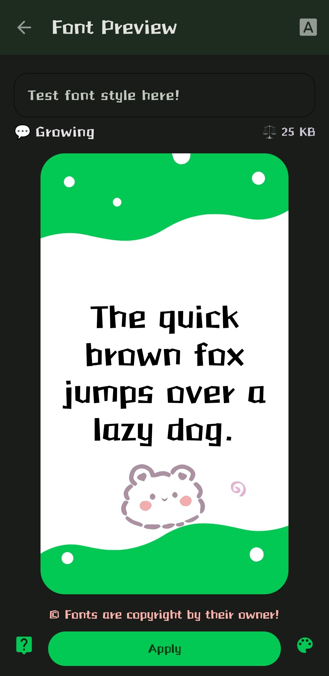
Hi everyone! Just wanted to ask if anyone has any idea what this typeface is actually called? It says it's called "Growing", but I couldn't find it under that name... If anyone has a clue, or an idea of where I can search... I'll be thankful for anything you can provide. Have a nice day y'all!

3


Its not much, as its a variation on Iosevka, exclusively for programming, and I made it a while ago, but I wanted to see what the community thinks. (I tried including a picture with the post but it failed to upload for some reason)

I'd love to see more open source self-made fonts. Any criticisims on functionality, or recommended changes are welcome.

4


I'm currently on the lookout for something quite specific:

  • Old style serif
  • Fairly heavy (not light at least)
  • Low contrast
  • Close to upright axis

I'm hoping those terms make sense, I'm not an expert :)

Where would you go for specific requirements like this? Most websites I find only have basic filters like serif/sans serif. Any suggestions for where to look, or maybe you know a nice font that fits what I listed above?

5
 
 
6


“Today we begin the final phase of this major change where Aptos will start appearing as the new default font across Word, Outlook, PowerPoint and Excel for hundreds of millions of users,” explains Si Daniels, a principal program manager at Microsoft, in a design blog post today. “And, over the next few months it will roll out to be the default for all our customers.”“Today we begin the final phase of this major change where Aptos will start appearing as the new default font across Word, Outlook, PowerPoint and Excel for hundreds of millions of users,” explains Si Daniels, a principal program manager at Microsoft, in a design blog post today. “And, over the next few months it will roll out to be the default for all our customers.”

I'm not sure I understand why they want to replace Calibri, but I guess a fresh typeface every now & then isn't a bad thing.

What do you all think of this Aptos?

7


I've built a new font! Thoughts and feedback on my approach very welcome.

8


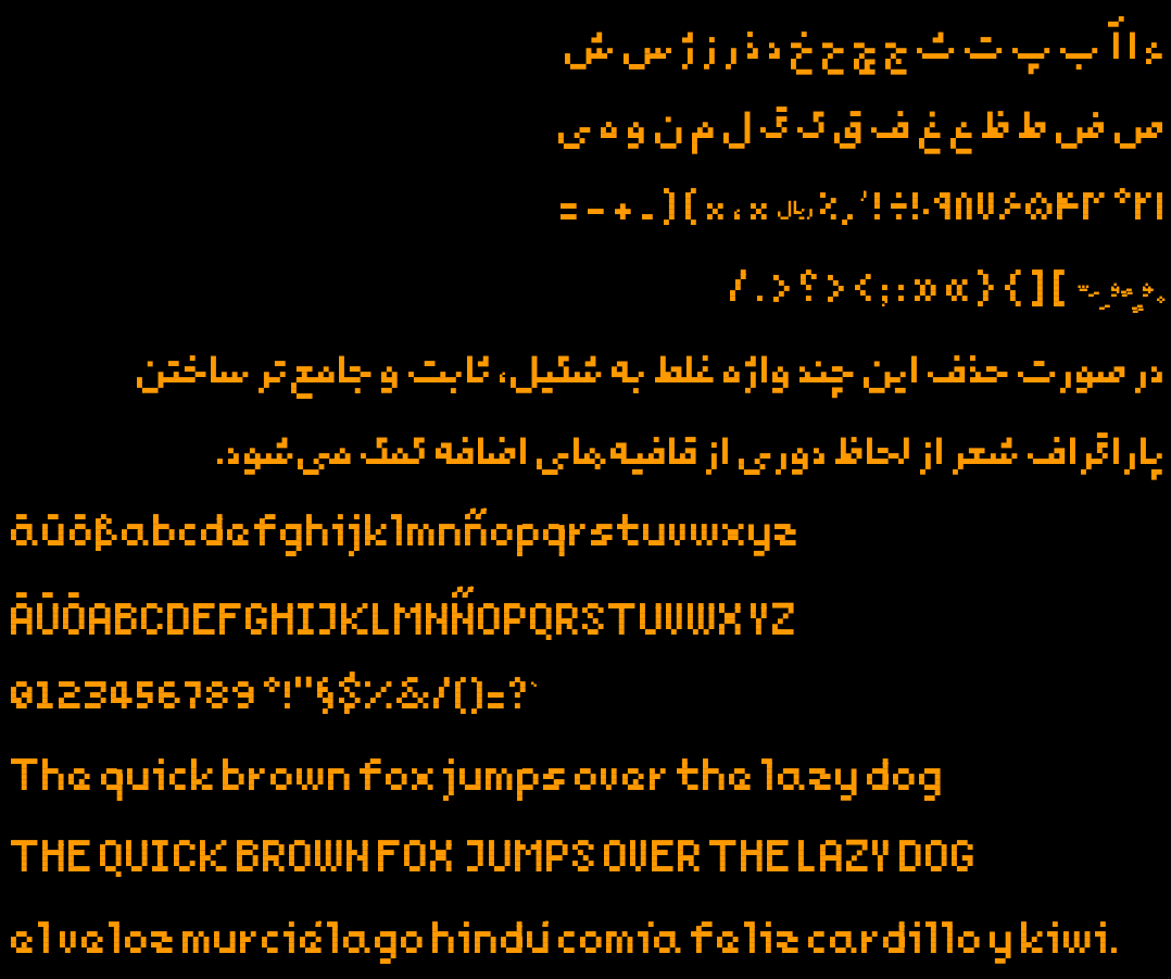
Last year I made a new pixelated free typeface for my 2d game. It has Arabic, Persian, and a subset of Latin glyphs enough for English, German and Spanish texts. Inside the repo you'd find makefile to build the font and generate test outputs.

Since it was my first experience designing a typeface ever, I might have made mistakes not known to me. That's why I post this, hoping someone would point them out. Here is the repo

https://github.com/mehdisadeghi/Noqte

9
10


Hey, I'm looking for a cool option for my Companys single letter Logo design. what do you think of this font?

11
28
submitted 1 year ago* (last edited 1 year ago) by Jakylla to c/[email protected]


What can we talk about on this new Community about fonts, others than the most controversial font of all time ?

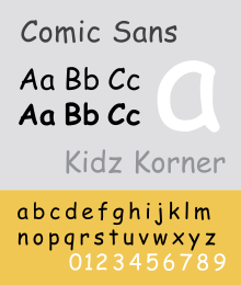
What do you think about Comic Sans MS ?

Do you use it ? Did you use it in the past ? Will you use it in the future ? Why ?

What do you like or dislike about this font ?

12


For years I've been using DejaVu fonts, but in the last years I had the feeling that this project had been abandoned. And indeed it has.

Does anyone know of good open-source alternatives?

I've heard of GNU Unifont, which seems still alive, but it isn't the kind of font one would use for, say, slides or websites.

Liberation and Kurinto were interesting (though not au par with DejaVu, in my opinion), but seem to have been abandoned as well.

I'm tired of Google and personally am not interested in fonts commissioned by them.