1
Hi,
is it possible to convert a path like this one
To a series of "line" stroke that are draw in the middle ? Like this (in green)
Thanks.
A community for users of Inkscape, the free and open source vector graphics editor.
All posts should clearly indicate the origin of artwork, or it must be clear from the article, video or page linked. Original content (created by the poster) should contain [OC] in the title.
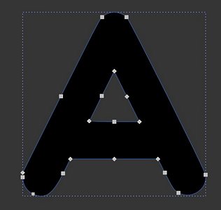
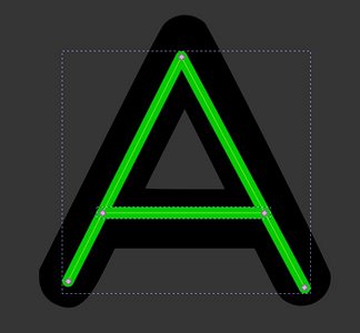
Hi,
is it possible to convert a path like this one
To a series of "line" stroke that are draw in the middle ? Like this (in green)
Thanks.
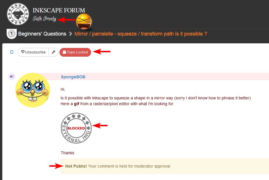
Hi,
Is it possible with Inkscape to squeeze a shape in a mirror way (sorry I don't know how to phrase it better) \
Here a gif from a rasterize/pixel editor with what I'm looking for

The same question on the official inkscape forum
 WTF the fuck happen to peoples ?
Internet should not be a place where everyone could express, share what he want ?!
WTF the fuck happen to peoples ?
Internet should not be a place where everyone could express, share what he want ?!
I'm glad their is Lemmy, so quick and easy
Hello! So I have been trying to do some low poly artwork using Inkscape. This is one of my recent ones. It is very rudimentary though 😅.
For the Inkscape discord server icon competition!!
A fusion of leopard and the looks of Lemmy logo. It is the part of new macOS application for browsing Lemmy, [email protected].
Artist: vintprox
This work is licensed under a Creative Commons Attribution 4.0 International License.

I suppose, it's not too complex and the headline of The New Oil website is delivered through this vector image in a good capacity. I really like Inkscape for all my minimalistic artwork. To understand the context, refer to issue and Penpot prototype.
The headline is "The Beginner's Guide to Data Privacy & Cybersecurity". At first, I just tried a bare oil drop representing the logo of TNO. This drop can be easily done with Path tool and mirrored through Path Effects or manually. I placed duotone gradients on both fill and stroke in such a fashion that gradients don't mix together (almost perpendicular directions).
It was the start, but it was pretty boring. It's not memorable. You visit a landing page of TNO and you already forget what discerned it from some oil company. But TNO is not about the oil per se - it's about data and being secure in the Internet. So, it was imperative to add reference to data privacy, while being true to the title and logo. Oil drop remains there without a question (and it will play a role in the layout of section below).
How to make it without overcomplicating? The first thing that comes to mind when people mention privacy is a lock of sorts. You put your data behind a lock and open it only for certain parties. It's just a simple analogy that would pour some nice oil in the delivery.
However, adding the lock alone doesn't resemble data privacy. It would just seem as if we put the oil behind that lock, silly! We're not blocking the oil, it's not the purpose of TNO. Can this be fixed?
I know it will sound awfully stock-ish, but "data" that we see in images is better represented with binary streams - 1s and 0s. I could immitate some text note with dashed lines, of course, but "data" we're talking about is not limited by plain text. It could be just any metadata that people want to secure, really.
This is nothing new, just yet another analogy on top of previous analogy that we've seen countless times while reading various articles. 0s and 1s are an artistic tool here and nobody's going to decypher them. Could use triangles or other shapes, but they aren't popular for showing data flow.
How do I combine this with aforementioned lock? I put zeros in a 3x3 grid to fill the lock base. Now it looks like a bunch of holes, but only I remember about "1", epiphany strikes. This same "1" can serve as a key hole. Of course! There must have been a hole for opening - what's the purpose of data if you can't eventually unlock it, right?
And so, we have 8 zeros and one straight line that looks like number "1" in the center. Zeros work as a translucent mask that softens the image in their place - this way, I don't need to introduce another color into mix. Key hole works as fully transparent inverse clip - you can look at it and think of it as a literal hole.
Lock itself has the gradient that, unfortunately, doesn't contrast well with the underlying oil drop. Poor design choice, isn't it? Despite that, I made a small detail that proved decisive later - gradient aligns perfectly with the gradient of drop's stroke.
After carefuly reviewing what decisions made it look cheap and underdeveloped, I came to a conclusion that the use of gradients differentiating in direction has to go away.
At the same, I needed to make the lock seem prominent. As usual, I could not afford adding another color to the mix. Even if I just used pure white or black, they would age badly with the ever changing background theme (light/dark). And that's where it clicked! Why not use the difference in transparency?
Alpha channel that can be manipulated by masking - that's the new guideline I came up with for every new stroke I make. It just looks a lot richer to me. Came as far as to remove any gradients from child objects and stamp one on a top-level object. Such is the way to avoid unnecessary repetition, DRY applied to vector graphics!
I aligned the stroke of same width from lock with the stroke from oil drop. A semi-transparent hole for the recess between shackle and base needed to be added, because of its small size combined with earlier strokes.
Everything's in place. This whole process led me understand how progressive minimalism can make image better with all the simple simple guidelines that I didn't even need to take from someone. It's about practice and challenge that you make for yourself.
In the end, image seems to fulfill the requirement for headline delivery - it helps the reader to memorize visuals and associate them with the underlying concept, what they came for.
You are welcome to disassemble my work to retrace how this vector image was produced in a non-destructive fashion, meaning that all underlying paths can be extracted and shapes can be changed for more experimentation.
This work is licensed under a Creative Commons Attribution 4.0 International License.


