Photon

267 readers
3 users here now

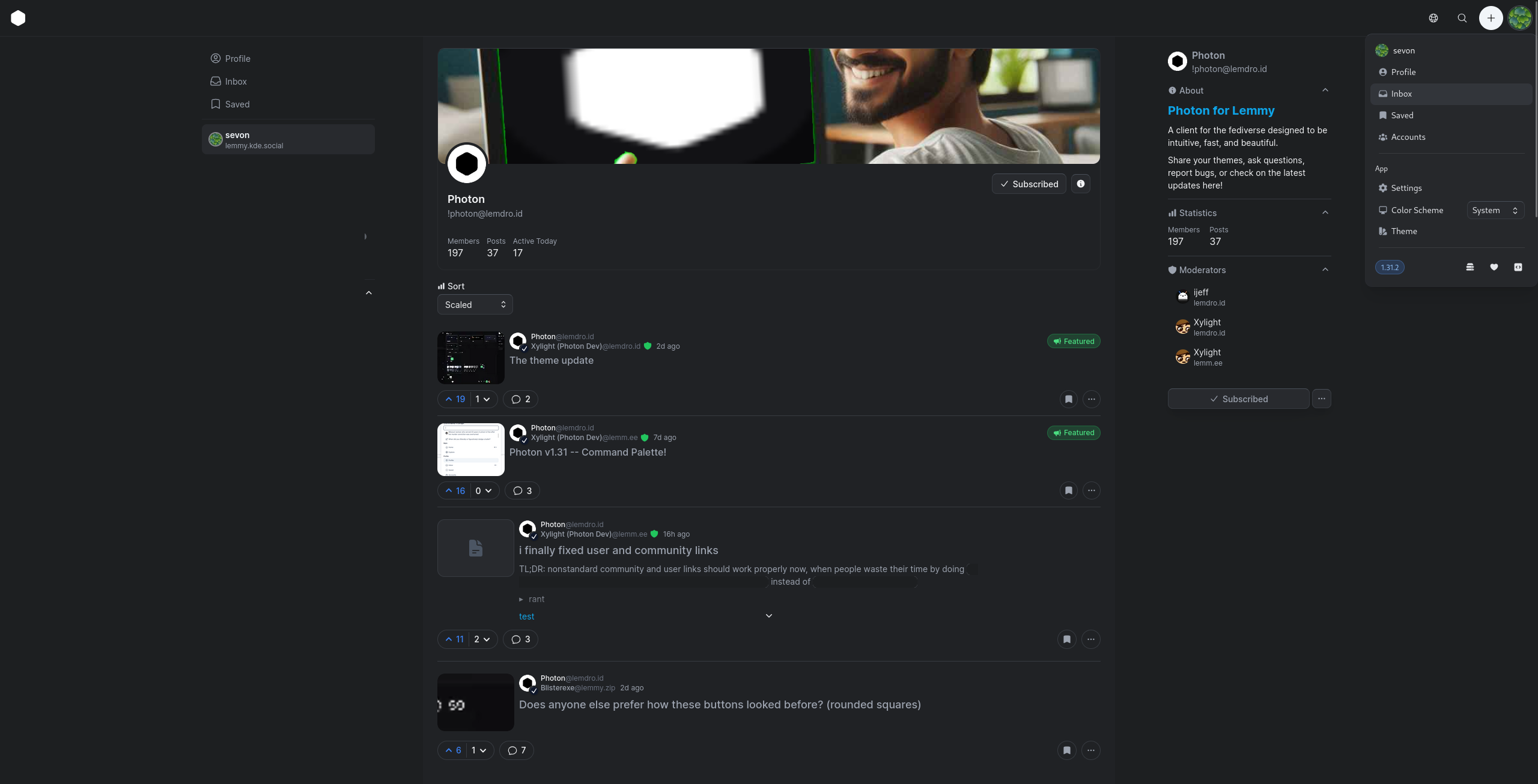
Photon for Lemmy

A client for the fediverse designed to be intuitive, fast, and beautiful.

Share your themes, ask questions, report bugs, or check on the latest updates here!

You can contact the dev at @[email protected].

Rules

  1. Posts must be related to Photon in any way
  2. Don't be mean
  3. If your post is a bug report, please preface the title with [solved] if it's been fixed.

founded 10 months ago
MODERATORS
26
18
Photon Gray Dark [theme] (lemmy.kde.social)
submitted 3 months ago* (last edited 2 months ago) by [email protected] to c/[email protected]


EDIT: This is now integrated to Photon as the Neutral theme.

I did this a while ago, when theming was first introduced. I wanted a dark theme that wasn't black, and also not tinted.

{"other":{"black":"#000000","white":"#ffffff"},"primary":{},"zinc":{"700":"#484e57","800":"#373b41","900":"#282a2e","925":"#202225","950":"#1d1f21"},"slate":{}}
27
10
submitted 3 months ago* (last edited 3 months ago) by [email protected] to c/[email protected]


TL;DR: nonstandard community and user links should work properly now, when people waste their time by doing [[email protected]](https://instance.url/c/community) instead of [[email protected]](/c/[email protected])

rantok so why do people, instead of using the proper syntax for users and communities, ([email protected] and @[email protected]) they take the EXTRA EFFORT to make it a NONSTANDARD MARKDOWN LINK which means linkify-it (which even the official lemmy-ui uses) won't work properly because its meant to make custom syntax like this to work very nicely BUT THEY MAKE IT A MARKDOWN LINK which means I SHOULDNT BE MODIFYING IT but they make it so i have to BECAUSE THEY TYPED EXTRA KEYSTROKES, USED MORE DB DATA, JUST TO RUIN THEIR LINK. JUST USE THE NORMAL LEMMY LINK FORMAT INSTEAD OF MARKDOWN LINK STUFF AAAA ok so get this right people are out here taking the PERFECTLY GOOD syntax for users and communities the one with exclamation point and at sign and whatever and blah but NOPE THAT MAKES TOO MUCH SENSE because im such a GENIUS im gonna wrap in a MARKDOWN LINK. WHY WHY WHY WHY it BREAKS STUFF and make s thing more complICATED i think every lemmy user should be sentenced to 87 years of parsing MARKDOWN WITH REGEX per LINK THEY DO THIS WITH. THIS MESSES EVERYTHING UP stop trying to be sepcial newsflash YOURe NOT JuST stop WITH thiS S

/s

test

28
23
The theme update (lemdro.id)
submitted 3 months ago* (last edited 3 months ago) by [email protected] to c/[email protected]


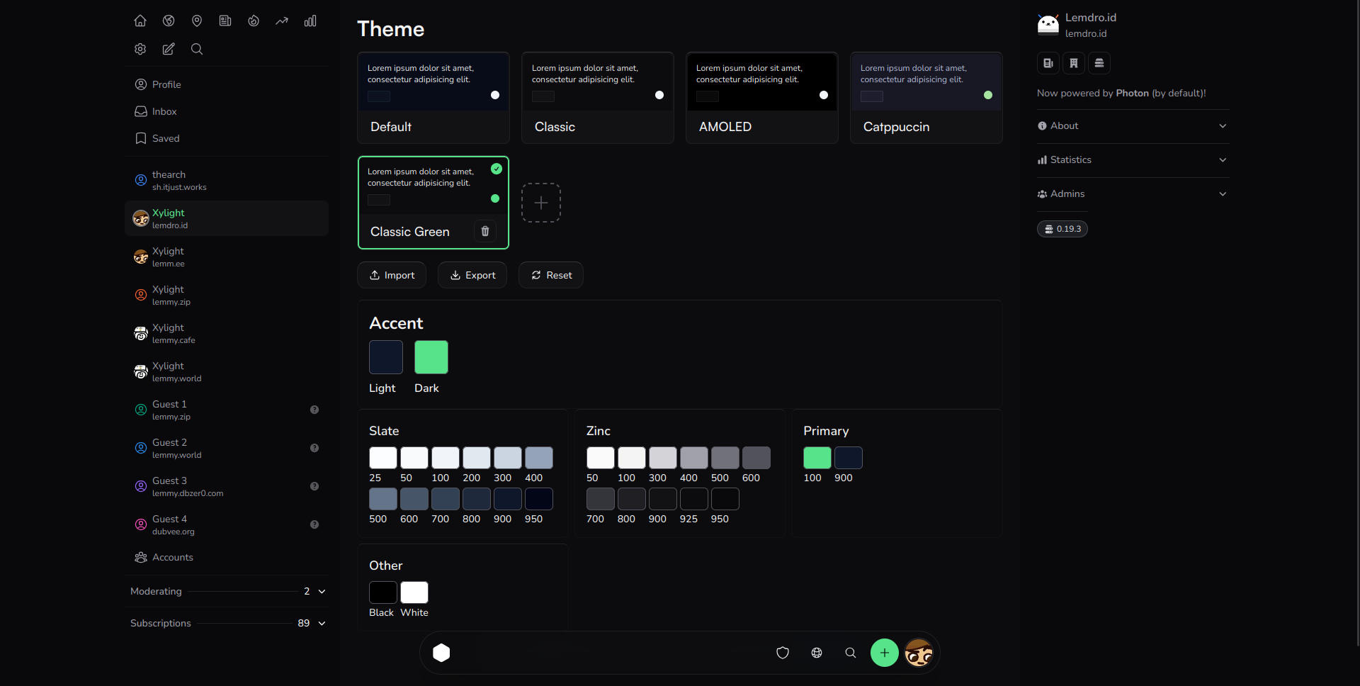
If you dislike the new default colors, just go to theme settings and select "photon classic"

This new update allows instance admins to set their own themes (via PUBLIC_THEME) and allows you to have multiple theme presets.

It's available on phtn.app right now, coming soon to a release

29
 
 
30


I like these colors, as it gives a bit more personality than neutral gray.

But what do you think? If I did make this the default dark theme, I would add presets to the theme page including a "classic" preset.

If you'd like to use this theme right now, here:

{"other":{},"primary":{"100":"#f3f4f6"},"zinc":{"100":"#f3f4f6","300":"#d1d5db","400":"#9ca3af","500":"#6b7280","600":"#4b5563","700":"#374151","800":"#1f2937","900":"#111827","925":"#080C19","950":"#030712"},"slate":{}}
31
13
submitted 3 months ago* (last edited 3 months ago) by [email protected] to c/[email protected]


This will be a test post for markdown, as I'm switching to a faster markdown renderer that will allow me to do some cool stuff, like allow expanding images and running my code in markdown.

It might release with v1.31.2.

32
17
submitted 3 months ago* (last edited 3 months ago) by [email protected] to c/[email protected]


arguably a bigger update than v1.31, lots of backend changes for better speed

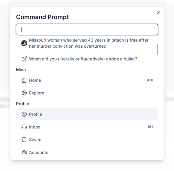
i've been using this command palette a lot because it makes doing everything so fast. let me know if there's any action or link you'd like added, since it's very easy to do.

What's Changed

  • feat: add a command palette by @Xyphyn in https://github.com/Xyphyn/photon/pull/364

    • Press / or ctrl + p or right click the photon logo to bring up the command palette
    • Instantly start typing to find a link, or run an action
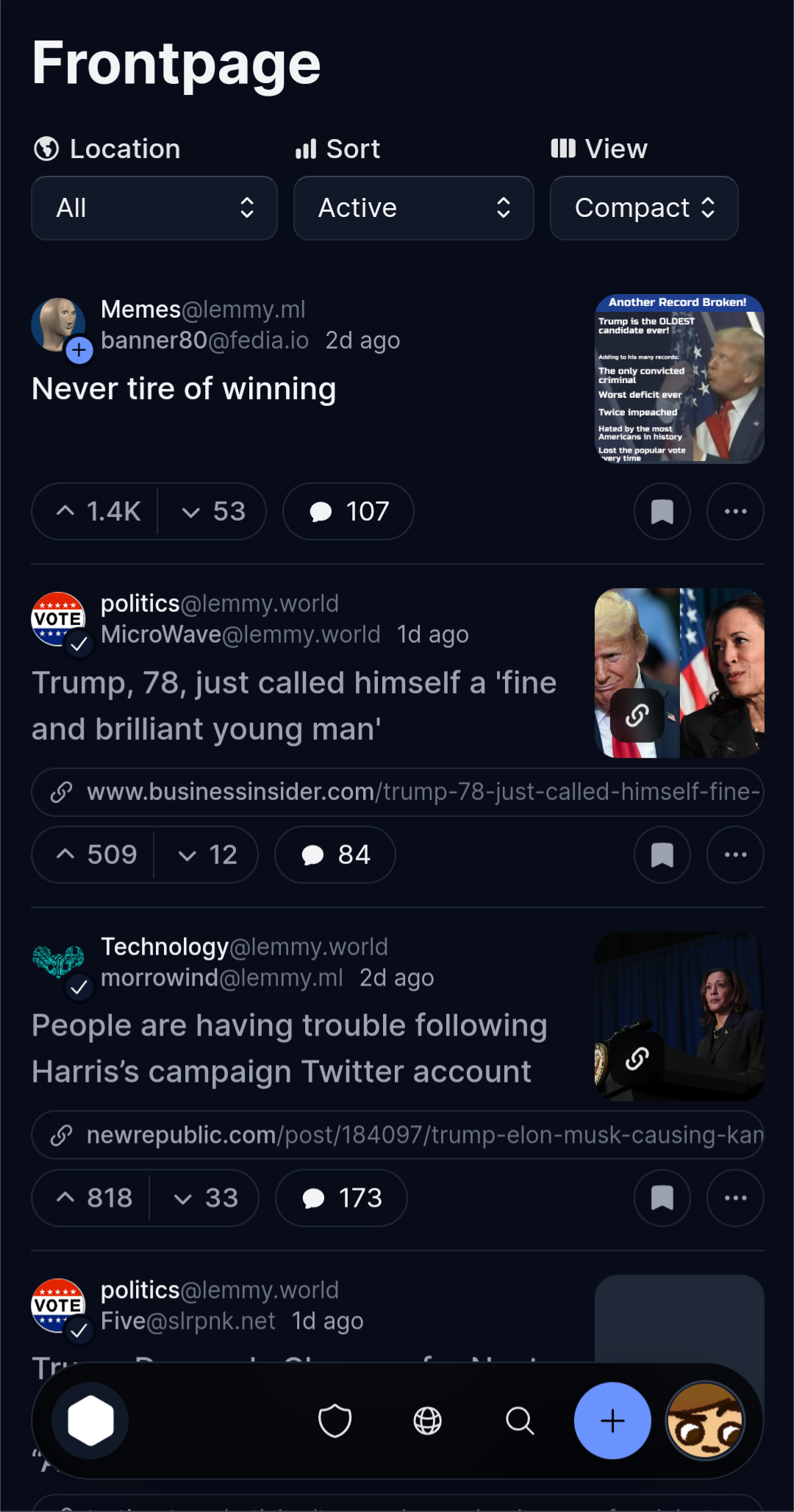
  • design: Make compact mode even more compact

  • misc: add infinite scroll to communities too

  • code: rewrite how post feeds are handled, improving speed and cleanliness and allowing more opportunities for caching.

  • misc: add support for upvoted/downvoted posts and uploaded media in the profile page

  • strings: tweak some strings for better clarity

  • Vertical postlink layout for mobile by @sevonj in https://github.com/Xyphyn/photon/pull/360

Full Changelog: https://github.com/Xyphyn/photon/compare/v1.31.0-fix.1...v1.31.1-rc.1

33
17
Command Palette! (lemdro.id)
submitted 3 months ago* (last edited 3 months ago) by [email protected] to c/[email protected]


I'm working on a command palette for Photon, which will allow you to press ctrl + p or / to open a prompt where you can type and go to a page or a recent post instantly.

Are there any actions or links that you'd want me to add?

34


This update is currently available on phtn.app, with a tagged release coming soon. Post navigation is down by 65% and returning from posts is instant.

What's Changed

  • feat: add infinite scroll

    • You can now scroll down infinitely without clicking next!
    • As a bonus, returning from a post page is now instant.
    • Of course, you can turn it off in settings.
    • A virtual list is also used so that infinite posts can be loaded with no performance impact.
  • feat: parse tags from title

    • Tesseract dev and I had the same idea, [tags in brackets] in posts will automatically be converted to a badge/flair. You can click it to search for all posts with that tag in a community.
    • I added options which let you choose flairs to blur posts of or hide.
  • tweak link design

  • improve smaller screen support

  • codebase: move $profile to a derived, immutable store to improve consistency

  • i18n: add new languages/update languages

    • Chinese
    • English
    • Estonian
    • French
    • Finnish
    • German
    • Hebrew
    • Portuguese
  • Update p.darrennathanael.com photon region by @DarrenOfficial in https://github.com/Xyphyn/photon/pull/350

  • Remove empty space left by hideTitle by @sevonj in https://github.com/Xyphyn/photon/pull/352

  • docs: Post component comments by @sevonj in https://github.com/Xyphyn/photon/pull/354

Full Changelog: https://github.com/Xyphyn/photon/compare/v1.30.4...v1.31.0-rc.1

35
15
test (lemm.ee)
submitted 4 months ago* (last edited 3 months ago) by [email protected] to c/[email protected]


I'm working on adding a feature that will convert tags in the title to flairs, which you can add custom filters/rules to.

36
23
submitted 4 months ago* (last edited 4 months ago) by [email protected] to c/[email protected]


Hey, I've been working on a few changes to photon that make it a lot faster to open posts and return, and as a result of these changes I can also make infinite scroll work. If you go to this link, Vercel will have commented on the post with a preview link. Those are basically the beta links.

Preview Link

Let me know of any bugs and any changes you'd like!

Current roadmap

  • [x] Make this not duplicate posts in memory
  • [ ] Make this work on all posts
  • [x] Use a virtual list for better render performance
37
47
submitted 4 months ago* (last edited 4 months ago) by [email protected] to c/[email protected]


all 0.19.4 features coming soon

38


One year ago, on June 24, 2023, I saw the migration to Lemmy. I wanted to make something like libreddit, so I decided to mess with Lemmy's API. Lemmy became something I wanted to use daily, so I got to work, and I made the first commit:

I started with something that reused components from another project of mine, Imagi. It looked awful and had no features. But, some people actually started using it, and I was motivated to continue this.

After about a month 0.0.1 was released, with very basic features.

One of the earliest Photon versions

39


The only thing that's missing from the new navigation layout is in my opinion an easily accessible "Frontpage" button like there was in the old navigation layout. So I made a pull request to re add the Frontpage, Settings and Explore buttons back into the sidebar for easier access.

40


On ... https://phtn.lemmy.blahaj.zone/

the "random" thread loader runs twice.

I am on a slow rural connection so it may not be noticeable in town.

I go to read the first post, then page gets replaced by different posts.

This does not happen on... https://lemmy.blahaj.zone/

I think there is yet another theme for blahaj, but have not tested it.

41


I feel currently Photon is the best web UI for lemmy, while Photon's front page only provides feeds of posts, but lemmy-ui or Alexandrite further provides feeds of comments. Personally I think feeds of comments are a good way to find interesting contents. Will Photon consider add such a feature?

42
5
Failed to fetch the page (discuss.tchncs.de)
submitted 5 months ago* (last edited 5 months ago) by [email protected] to c/[email protected]


I have an issue with proton. I hosted the software on my own homeserver with portainer.

Often it comes the failure "TypeError: NetworkError when attempting to fetch resource."

when i try to upload images

or

when I try to post something

in photon. It doesnt work in Firefox (Mac) or Safari (iOS, MacOS).

The instance is not the problem. It works with voyager.

43
15
submitted 5 months ago* (last edited 5 months ago) by [email protected] to c/[email protected]


This is great on OLED screens, the background is true black and darker colors are used in many spots. Orange is the accent color to not burn your eyes with blue light, but you can change it.

{"other":{},"primary":{"900":"#000000"},"zinc":{"900":"#0a0a0a","925":"#000000","950":"#000000"},"slate":{}}
44
23
submitted 5 months ago* (last edited 5 months ago) by [email protected] to c/[email protected]


New stuff

  • Revert the positions of most navigation buttons (Home on left, profile on right)
  • Add "adaptive" options to dock settings
    • This will make the dock's position (top, bottom, floating or not) change based on your screen size (it is now the default)
    • So on mobile, you'll have a bottom, floating dock but on desktop a top panel

Fixes

  • Add autofocus to search bar #319
  • Don't hide titles on iframes #317
  • Add refresh button to inbox page #313
  • Dock covers sidebars as a top panel
  • Add maxlength to password form #312
45
18
submitted 5 months ago* (last edited 5 months ago) by [email protected] to c/[email protected]


Update: Photon v1.29.4 has addressed these concerns. Let me know what you think here

It seems the navigation is widely disliked by many people. I want Photon to be the most intuitive UI, so I'd like to fix this. Which of these should I do?

A - Revert the positions of the items on the navigation bar (Profile on right, home on left)

B - Have the default navigation be top on desktop

C - Move some things out of the profile menu into the navbar.

D - Revert the navbar entirely

Or give any other ideas you have. These changes were pushed early because I did not see any pushback early in the betas.

My only fear is that changing it back yet again will have ruined the muscle memory for both types of navigation.

I'll be releasing some betas soon to adjust navigation and take in more feedback before committing.

46
6
New layout feels atrocious (lemmy.dbzer0.com)
submitted 5 months ago* (last edited 5 months ago) by [email protected] to c/[email protected]


Why was "Profile", "Inbox" and "Saved" switched with "Home"? On a big screen "Home" is all the way in the top right corner even though it is an action that is used way more than viewing your profile, inbox and/or saved posts/comments?

And there is no reason to have the menu that is accessed by your profile pic to be in the opposite corner. IMO this is all very unintuitive.

At least return the home menu point to the left column menu. Please.

It feels like these changes were mainly done for mobile and desktop was a bit forgotten.

47
13
submitted 6 months ago* (last edited 2 months ago) by [email protected] to c/[email protected]


What's Changed

  • Redesign navigation
    • If you dislike the change, go to settings and press "Legacy Navigation Style". This will make the navigation similar to before
    • You can see 5 of the most recent posts and communities for quick access.
  • Use your accent color in more places
    • You can change your accent colors in the theme menu.
  • Improve design consistency
  • New font option
  • Change animation curves to be more bouncy
  • Add option to make featured posts more compact
  • Remove hooks.server.ts to make requests faster

Full Changelog: https://github.com/Xyphyn/photon/compare/v1.28.4...v1.29.0

48


Been using photon for a while now and I really enjoy the minimalistic design!

However, not user about this new floating bar, look very "phone" to me, and I dont really see the utility of having previously-visited posts and communities.

49
12
Gruvbox Theme (i.imgur.com)
submitted 7 months ago* (last edited 7 months ago) by [email protected] to c/[email protected]


I had it made by ChatGPT 3.5, so the theming is not perfect. I don't have the time to mess with this right now.

If you are feeling generous, you may customize it and post the changes in the comment section of this post.

{
  "other": {
    "white": "#fbf1c7",
    "black": "#282828"
  },
  "primary": {
    "100": "#ebdbb2",
    "900": "#282828"
  },
  "zinc": {
    "50": "#ebdbb2",
    "100": "#d5c4a1",
    "200": "#bdae93",
    "300": "#a89984",
    "400": "#a89984",
    "500": "#a89984",
    "600": "#928374",
    "700": "#7c6f64",
    "800": "#665c54",
    "900": "#504945",
    "925": "#3c3836",
    "950": "#282828"
  },
  "slate": {
    "25": "#ebdbb2",
    "50": "#d5c4a1",
    "100": "#bdae93",
    "200": "#a89984",
    "300": "#928374",
    "400": "#7c6f64",
    "500": "#665c54",
    "600": "#504945",
    "700": "#3c3836",
    "800": "#282828",
    "900": "#282828",
    "950": "#282828"
  }
}

50
42
submitted 7 months ago* (last edited 5 months ago) by [email protected] to c/[email protected]


Photon Announces Revamped Design

We're thrilled to unveil a significant redesign of Photon, the user interface for the fediverse! Since its inception, Photon has strived to make the fediverse more accessible with a user-friendly design.

Mono-Light addresses a key request from our community: increased information density. This redesign allows you to view more content at a glance, streamlining your fediverse experience.

Here's a glance at our new design:

As you can see, every UI element has been streamlined while still remaining beautiful. You can see so much more at once, with no sacrifice to usability. Got fat fingers? just cut a bit of it off.

You can expect this new design to roll out by the end of today, April 1st.

...No offense to the mlmym devs. Photon users want a clean UI, while mlmym users want an information dense, old reddit like UI.

view more: ‹ prev next ›