Bicycle Touring and Bikepacking
For all the pedal pushers out there that love long distance cycling. There are no gear requirements and no 'minimum distances' here.
Have you ridden for a cheeky overnighter or a 3 year global trek? Doesn't matter, you're welcome here.
Have you got panniers, bikepacking bags or just a backpack with the essentials? Doesn't matter, you're welcome here.
Have you got the latest in carbon engineering or your dads old 10 speed from the 70's? Doesn't matter, you're welcome here.
Related Communities
- [email protected]
- [email protected]
- [email protected]
- [email protected]
- [email protected]
- [email protected]
- [email protected]
So now i just used this icon as the community icon. If anybody wants to see changes made to it, i am open to do those, as long as it is in my capabilities, or also open for alternative icons that are free to use. Just thought it would be good to have at least some icon there.
Not bad at all!
there are some pretty good icons like this one 
source: https://thenounproject.com/browse/icons/term/touring-bike/
Yeah that icon you found is quite good. I like that it has a variety of bags, not just the 4 pack or something.
That looks nice. Maybe add a background though? E.g. This generic bicycling community has it pretty neat: https://lemmy.world/c/bicycling
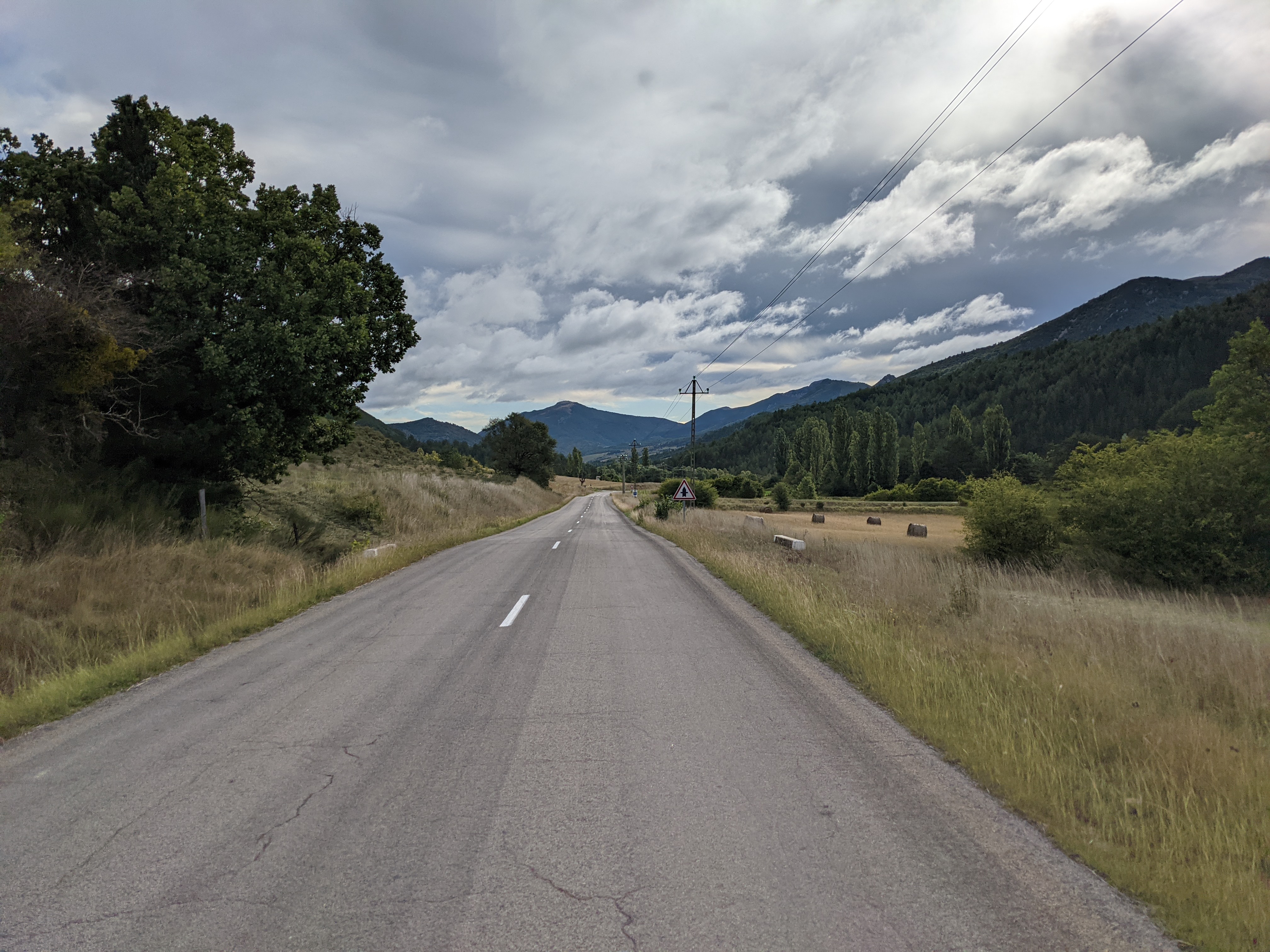
For an icon i have no idea really. For the banner i think something like this could be good, not that this should be it, just as a concept:

Just some open road, nothing too spectacular, something that everybody touring can connect to. I usually don't do landscape photos, just portraits (of my bike, haha), so i don't have a lot of them. Or they are too much of a highlight that they don't ring 'bicycle touring' anymore.
edit: I'm not sure if more abstract bicycle icons are so good, there are already a few from other bicycle c's. Without panniers though. But i think the c's with just photo icons also work fine, like [email protected] for example. They only have an icon, no banner, i like it.
Open road is good. But maybe one going straight into the horizon would work better as a banner?
Yeah, i don't think this is the image, just an example. A smaller road or gravel road would also be nicer. I tried to take other photos but i think the weather was just too shit.
I was just thinking that pictures that are less specific, where people don't think 'well that doesn't look like my bike' would be good. I really liked the banner that was on the touring sub on reddit. At least on old.reddit, not sure if there was something else on new.
Icon is most important though anyway i think.
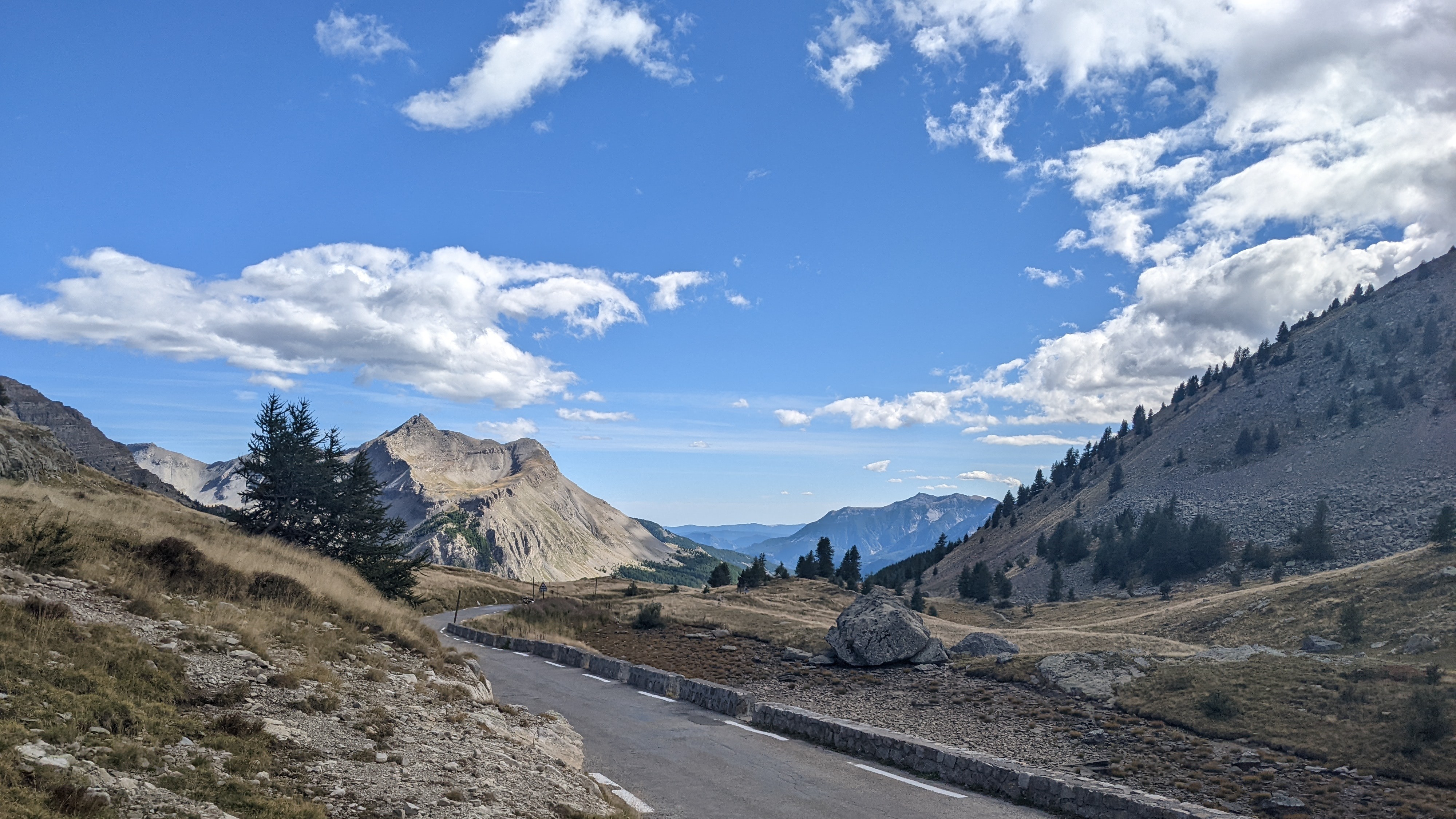
A picture from col de la cayolle in France, cropped my bike out:

*edit: very nice col to cycle BTW, really mellow grade from barcelonette, calm narrow road, beautiful and varied scenery.
