this post was submitted on 09 Nov 2023
11 points (100.0% liked)
Apple
17445 readers
154 users here now
Welcome
to the largest Apple community on Lemmy. This is the place where we talk about everything Apple, from iOS to the exciting upcoming Apple Vision Pro. Feel free to join the discussion!
Rules:
- No NSFW Content
- No Hate Speech or Personal Attacks
- No Ads / Spamming
Self promotion is only allowed in the pinned monthly thread
Communities of Interest:
Apple Hardware
Apple TV
Apple Watch
iPad
iPhone
Mac
Vintage Apple
Apple Software
iOS
iPadOS
macOS
tvOS
watchOS
Shortcuts
Xcode
Community banner courtesy of u/Antsomnia.
founded 1 year ago
MODERATORS
you are viewing a single comment's thread
view the rest of the comments
view the rest of the comments
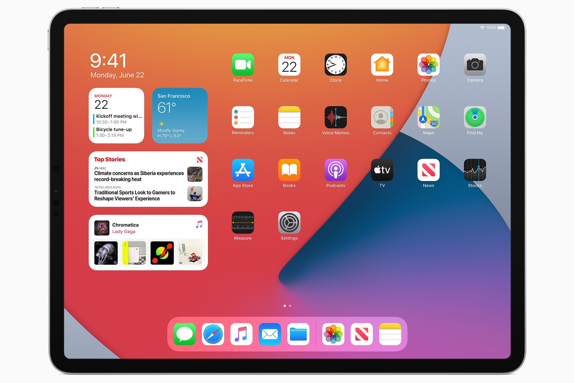
Yes, this (from iPad OS)

The digital clock widget? Other than that, it’s very similar to my current iPad Home Screen layout
The widgets you add to the home screen aren't the same as this Today View. Know how you side left from the first page, and it has a widgets view? The iPad had the option to keep that view permanently on the screen and bunch the icons to the right. The option was called "Keep Today View on Home Screen":
https://www.macobserver.com/tips/quick-tip/today-view-iphone-ipad/
https://youtu.be/Y6YY06bLEEo?si=w1MHfiw1GJD6yjSg
IMHO, it was a much better implementation of home screen widgets than what we have now.
Yeah, I see it’s slightly different from today’s widgets on the Home Screen. That’s closer to how I wished it worked, but how it works now seems more flexible
Here is an alternative Piped link(s):
https://piped.video/Y6YY06bLEEo?si=w1MHfiw1GJD6yjSg
Piped is a privacy-respecting open-source alternative frontend to YouTube.
I'm open-source; check me out at GitHub.