memes
Community rules
1. Be civil
No trolling, bigotry or other insulting / annoying behaviour
2. No politics
This is non-politics community. For political memes please go to [email protected]
3. No recent reposts
Check for reposts when posting a meme, you can only repost after 1 month
4. No bots
No bots without the express approval of the mods or the admins
5. No Spam/Ads
No advertisements or spam. This is an instance rule and the only way to live.
Sister communities
- [email protected] : Star Trek memes, chat and shitposts
- [email protected] : Lemmy Shitposts, anything and everything goes.
- [email protected] : Linux themed memes
- [email protected] : for those who love comic stories.
I remodelled my baby's mobile for exactly this reason. Seemed stupid to have the animals face up when baby is underneath, so I turned them round and made them detachable so baby could pull them off and play with them too.
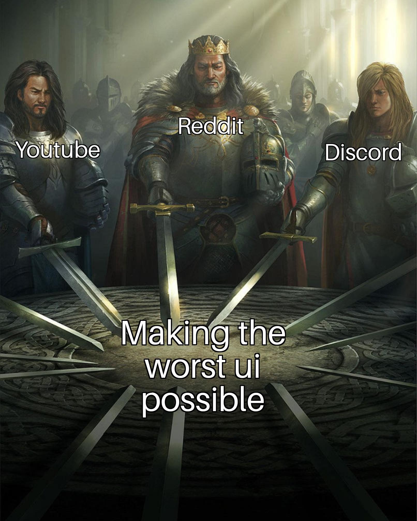
The UI of Youtube is actually not bad. What is bad is how the search function has gone to shit, constant promotion of youtube Shorts taking up half the screen, and the algorithm getting steadily worse at recommending videos.
The interface itself is pretty easy to navigate.
imo loading several video recommendations while im just scrolling through comments is very bad, especially because the API calls are seperate and load both sides seperately. huge waste of bandwith when im only interested in the text, which is barely any bandwidth
Youtube 2012 loaded in 1 second on a 5MBit line. HTML, CSS and JS for a page was a few hundred kilobytes.
You can profile the current "responsive" version in your browser. It might not look horrible but it's a technical abomination. I doubt it'll even load anymore in a browser from 2012.
You forgot Quora. That site used to be semi-useful. These days I can never tell whether I’m reading an actual answer to the question or just some random recommended post that’s been shoved in in between.
Just use a 3rd party a....h, crap.
The discord UI was great. And then they made it ugly and slow as fuck.
The secret ingredient is enshittification.
It’s actually optimized for them. The goal is to get users to spend time and see ads etc. The UI is not made for us users.
Haha, you think those are bad? Try any professional tools, like CAD's, DAW's, or 3d modelling software.
Or, even worse, any internal corporate software, the bigger and the older the company is, the better... at being the worst, that is.
Or. actually, just go to an any airline's office to buy a ticket and witness the atrocity they have on their monitors. No, those are not blue screens of death. That bunch of gibberish is the actual UI. And the only way to interact with it is by typing in commands that read like something that Lovecraftian creatures would sound like.
Command line isn't actually bad UI for professionals. It's way faster than using a mouse.
Anyone who thinks that these three have the worst UI possible has never had to deal with a really bad UI. Try Sharepoint on for size. Or Azure. Or Jira. And there's likely still way worse stuff than those.
I'm not seeing "Amazon" or the plethora of online shopping stores that have followed in its footprint of complete and utter shit. To this day, I can't understand how Amazon became so big with a user interface so fucking awful but goes to show it doesn't actually fucking matter.
Amazon UI is so bad if you type 'subs' in the product search it auto-suggests 'subscriptions on my account' and a dozen 'subscribe and save' variations because people wind up using the product search trying to find that stuff.
Let’s add google drive.
I hate their ui.
Can someone tell me how to force Google drive to show me folders instead of files on start? Why would I ever need to look at a mess of files? I spend time organizing them into folders a reason, no thanks Google I really wanted them haphazardly thrown in my face.
GIMP
How do you have these listed and not the myriad of FOSS products that are garbage to use.
Y'all remember mumble? Easy peasy compared to discord amirite?
GIMP looks a lot nicer than it did 20ish years ago, but it's still really really bad.
I can somewhat forgive FOSS tools for having poor UI, but GIMP is one tool that really should have some love poured into the UI and how usable it is for power users.
Discord always had the worst UI I've ever seen. Followed by Snapchat.
Discord's new mobile app is fucking unusable sometimes. Sometimes I just stuck with that add picture pop up and nothing I do will make it go away.
Not to mention that all of the controls disappear off the screen the second you don't click on them so you can't just mute yourself conveniently you have to tap the screen twice to bring up the icon to click so you can mute yourself but sometimes it doesn't recognize when you click on the screen.
I'm just impressed with how unbelievably terrible that app has gotten. I didn't even think about it before, It was just simple to use.
I know this is a slightly different category, but Snapchat's UI is absolutely the worst- far worse than all of these. It's my go-to UI to pick on.
Reddit must have an entire QA department dedicated ro making the UI shitty. Like how can you make a shit ui even worse. It can't be an accident, you gotta be doing it on purpose.
For YouTube, use FreeTube, Tubular or LibreTube if you like native clients or Piped and Invidious if you prefer a website.
It's best not to use Reddit at all, but if you need it for some reason, check out Libreddit or this site
Unfortunately not much can be done to avoid Discord's terrible UI other than not using it. The Matrix protocol and Element client are pretty nice alternatives.
Discord was a train wreck from the off
Not sure where the discord hate is coming from (besides the new mobile app). If you're someone who has to use Teams for work, surely you'd kill to switch to Discord instead.
Spotify joins the chat
It was quite alright. Limited but ok. Then they started shuffling things around and made everything cluttered and cumbersome and ugly and by now it's seems to be tradition with every update.
Bring back when companies wanted their users using their software, not forcing only one channel of usage.
The other day I went Tumblr to make sure that I'd turned off their opt-out AI data mining and literally could not find the login page. I eventually had to use the URL in my password DB. Turns out I'd deleted my account already. Good riddance.
So who has a good UI for comparison?
All of the apps that existed before the API changed (Reddit specifically)
None of those have such a bad UI, if you think those are bad then you probably never had to use atrocious apps for work!
I make the atrocious apps for work.
Let me tell you, every out of place button or weirdly niche function placed prominently on the main screen is the fault of some bastard who won't buy the system from us until it's just as ugly as their old system, and they've got just enough money for us to have to give a fuck about it.
I don't know what the problem with Discord is. It isn't that different than it was before and it's actually easier to navigate now. Maybe it's just because I hadn't been using it much before the change?
They changed the mobile app, it used to be like the desktop app (standard desktop chat gui) but adapted for phones, now it's different and kinda sucks (not because it's different, but because it's janky and buggy and can take 5-10 sec to load anything other than the channel you were in when you last closed it)


