this post was submitted on 28 Oct 2024
73 points (92.9% liked)
NoSafetySmokingFirst
490 readers
182 users here now
Welcome to NoSafetySmokingFirst!
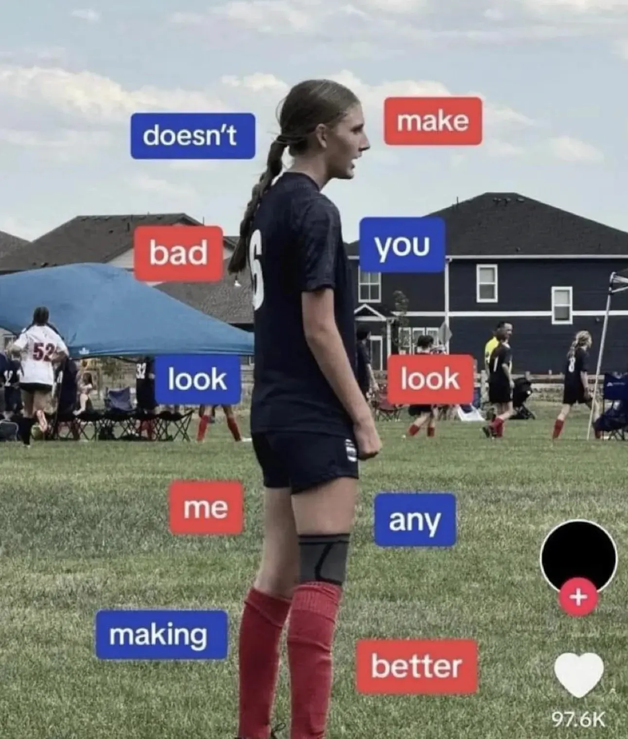
For images where the text reads correctly left to right, but visual cues (like colouration, vertical proximity, or horizontal separation) lead you to try to read it top to bottom.
This is similar to, but distinct from, the more widely known “DontDeadOpenInside” format. In that case, the text reads correctly top to bottom, but visual cues (like colouration, horizontal proximity, or vertical separation) lead you to try to read it left to right.
The post that started it all:
Other related communities:
- [email protected]
- [email protected] (letters arranged in any confusing order)
founded 2 months ago
MODERATORS
you are viewing a single comment's thread
view the rest of the comments
view the rest of the comments

God this was terrible. In case you are still racking your brain here is my easy way to see this stupidity. Image they wanted to lay all the text on the bottom of the image and decided to instead wrap the text around the soccer player. Start at the bottom left. Like a word salad roller coaster.
Or you can re-learn how to use a graphing calculator and use the formula provided.
Thanks for this. I was genuinely trying to work out whatever the fuck this was supposed to say for longer than I care to admit.