this post was submitted on 25 Jul 2023
28 points (100.0% liked)
Typography & fonts
385 readers
2 users here now
A community to discuss and share information about typography and fonts
Sibling community:
Rules of conduct:
The usual ones on Lemmy and Mastodon. In short: be kind or at least respectful, no offensive language, no harassment, no spam.
(Icon: detail from the title of Bringhurst's Elements of Typographic Style. Banner: details from pages 6 and 12, ibid.)
founded 1 year ago
MODERATORS
you are viewing a single comment's thread
view the rest of the comments
view the rest of the comments

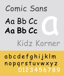
I used it in the past but only because there was no real alternative at the time. I suppose as far as sans serif goes it’s the one that at a glance seems most like a handwritten font especially since fonts are usually alphabetically categorised, compared to courier new anything looks good. Once you use it and learn about typography you then see how bad it is.
Never thought about the alphabetization aspect. That's interesting. It probably does go into its popularity.
I wonder if that's why Arial, Calibri, and Cambria are so ubiquitous along with Courier. I guess Times New Roman is only commonly known because it's old.