1
A place to discuss anything and everything regarding Hair Dye
cross-posted from: https://sh.itjust.works/post/32623445
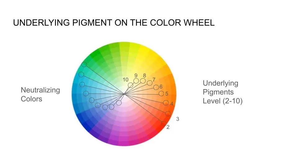
This hair color wheel visually represents the underlying pigments naturally present in human hair at different levels. These pigments are revealed when hair is lightened:
Underlying Pigments by Hair Level:
- Level 2 (Darkest Brown/Black): Deep Red
- Level 3 (Dark Brown): Red
- Level 4 (Medium Brown): Bright Red
- Level 5 (Light Brown): Red-Orange
- Level 6 (Dark Blonde/Light Brown): Orange-Red
- Level 7 (Medium Blonde): Orange
- Level 8 (Light Blonde): Gold (Yellow-Orange)
- Level 9 (Very Light Blonde): Yellow
- Level 10 (Platinum Blonde): Pale Yellow
Complementary (Opposite) Colors for Neutralization:
Every underlying pigment has an opposite (complementary) color on the color wheel. These opposite shades are used to neutralize unwanted warmth when toning or adjusting hair color:
- Deep Red (Level 2) → Opposite: Green (Neutralizes dark red tones)
- Red-Violet (Level 3) → Opposite: Green (Balances red hues)
- Red (Level 4) → Opposite: Green (Cancels strong red undertones)
- Red-Orange (Level 5) → Opposite: Blue-Green (Neutralizes warm red-orange tones)
- Orange-Red (Level 6) → Opposite: Blue (Cancels orange-red warmth)
- Orange (Level 7) → Opposite: Blue (Neutralizes brassy orange tones)
- Gold/Yellow-Orange (Level 8) → Opposite: Violet-Blue (Balances warm golden hues)
- Yellow (Level 9) → Opposite: Violet (Tones down bright yellow tones)
- Pale Yellow (Level 10) → Opposite: Soft Violet (Gently cools down any remaining warmth for a platinum finish)
How to Use This Wheel in Hair Coloring: Understanding underlying pigments and their complementary colors is essential for achieving balanced, natural-looking hair color results. When lightening hair, unwanted warmth can be controlled by selecting the opposite shade on the wheel:
- Want to neutralize brassiness? Use blue or violet-based toners.
- Want to enhance warmth? Choose a shade with gold, copper, or red tones.
- Going from dark to light? Expect underlying pigments to shift in this predictable order—and plan toning accordingly.